Transforming your images into stunning black-and-white tones with depth and texture has become easier than ever with the powerful grayscale filter. Adding a touch of gray to your images creates a modern vibe and turns them into art. To achieve this effect, we use the CSS filter: grayscale(%) property.
The grayscale filter allows you to adjust the percentage of gray. When you increase the percentage, you boost the effect. An image with 0% grayscale maintains its authentic colors, while at 100% grayscale, the image is entirely transformed into a cold, grayish tone.
Join me 😃 in the magic of the grayscale filter, explore how it can be merged harmoniously, and enhance your techniques.
Monochrome – Grayscale method#
The grayscale method, or in other words, monochrome photography method, captures and displays different levels of light but not different colors. It includes all forms of black-and-white photography, which produces images with shades of gray ranging from black to white.
It originated in the 1820s when Nicephore Niepce, a French inventor and photographer, created the first photograph. In today’s world, monochrome photography is mainly used for applications other than photographs.
Applying the grayscale filter to an image#
Below, I’ve prepared an example to help clarify this property for you! 😃 So, let’s move forward.
We begin with our HTML and CSS code snippets.
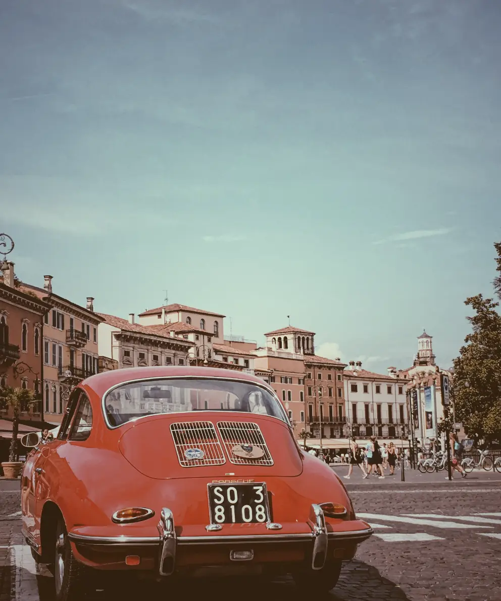
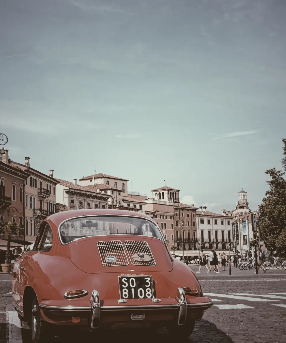
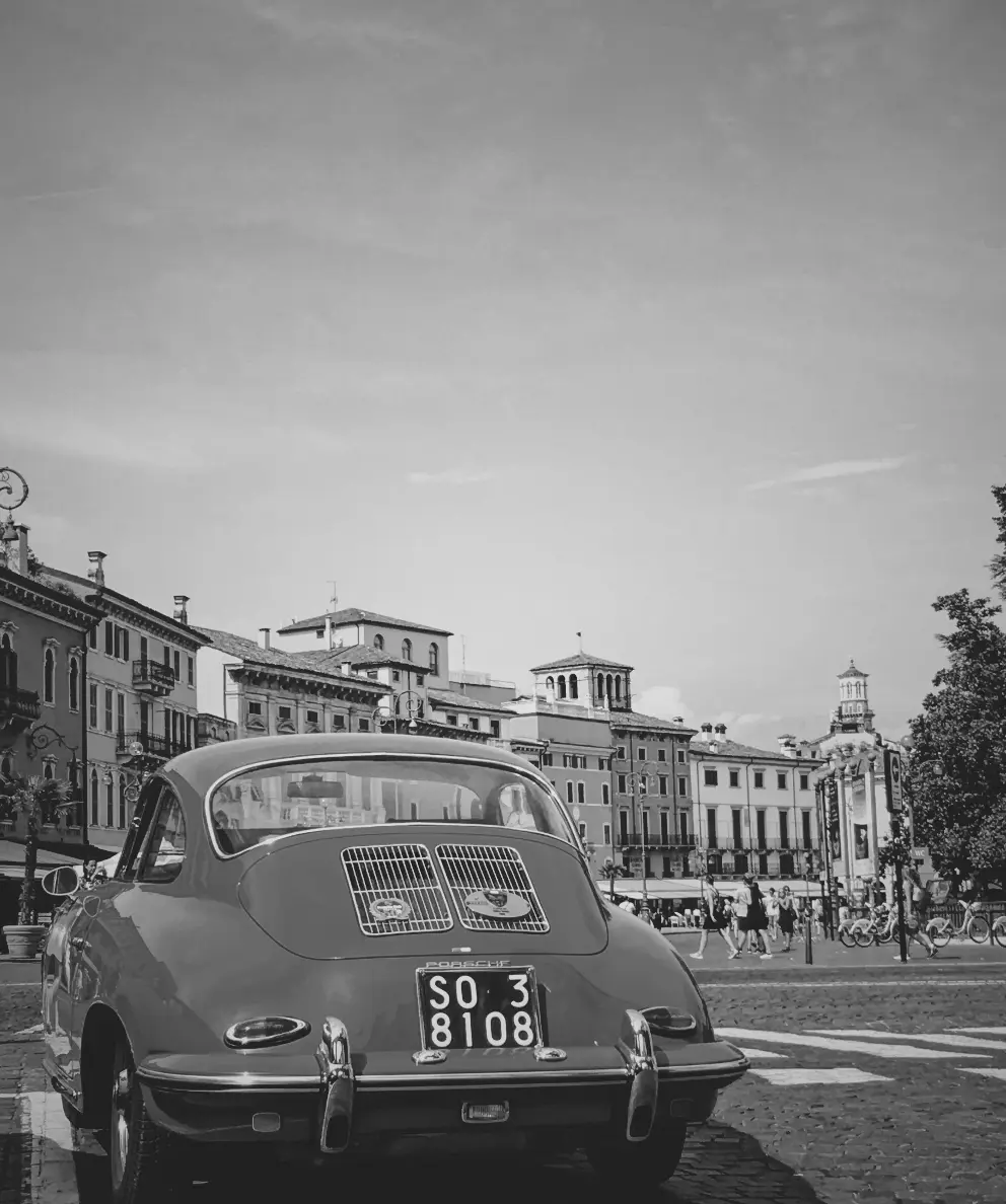
The HTML snippet includes three img elements. The first one has the .original-image class, indicating a standard image. The second also has .original-image plus .with-grayscale, and the third has .original-image plus .with-grayscale-full, meaning they are styled images using the grayscale filter, giving them a cold, grayish tone.
<img class="original-image"/>
<img class="original-image with-grayscale"/>
<img class="original-image with-grayscale-full"/>
The .original-image class is applied to all image elements, setting a background image, ensuring no repetition, and covering the specified dimensions of 400px width and 500px height.
The .with-grayscale and .with-grayscale-full classes, applied only to the second and third images, introduce a grayscale filter. In the second case, it is set at 50%, displaying our image with some grayish tones, while in the third case, it is set at 100%, decolorizing our image and declaring a completely gray tone.
.original-image {
  background-image: url('...');
  background-repeat: no-repeat;
  background-size: cover;
  width: 400px;
  height: 500px;
}

.with-grayscale {
  filter: grayscale(50%);
}

.with-grayscale-full {
  filter: grayscale(100%);
}
By positioning the three images side by side, we can clearly 🧐 observe the contrast among them. It’s absolutely captivating. Don’t you agree? 😃