

Hello, there 😃 Let’s step into a digital world where CSS brings forth the captivating CSS text outline effect. It’s a simple yet powerful technique that adds structure and clarity to texts and elements.
Let’s dive into how CSS outlines 🖋 can make a significant difference in the visual appeal of your website. 💻 🫧
Create basic HTML and CSS structure#
As a first step, we need some basic HTML structure to apply our CSS stylings.
<body>
  <div class="outline-effect">outline effect</div>
</body>/* insert google fonts */
@import url(
'https://fonts.googleapis.com/css2?family=Emilys+Candy&display=swap'
);
body {
background-color: purple;
}
.outline-effect {
width: 650px;
font-size: 180px;
text-align: center;
font-family: 'Emilys Candy', cursive;
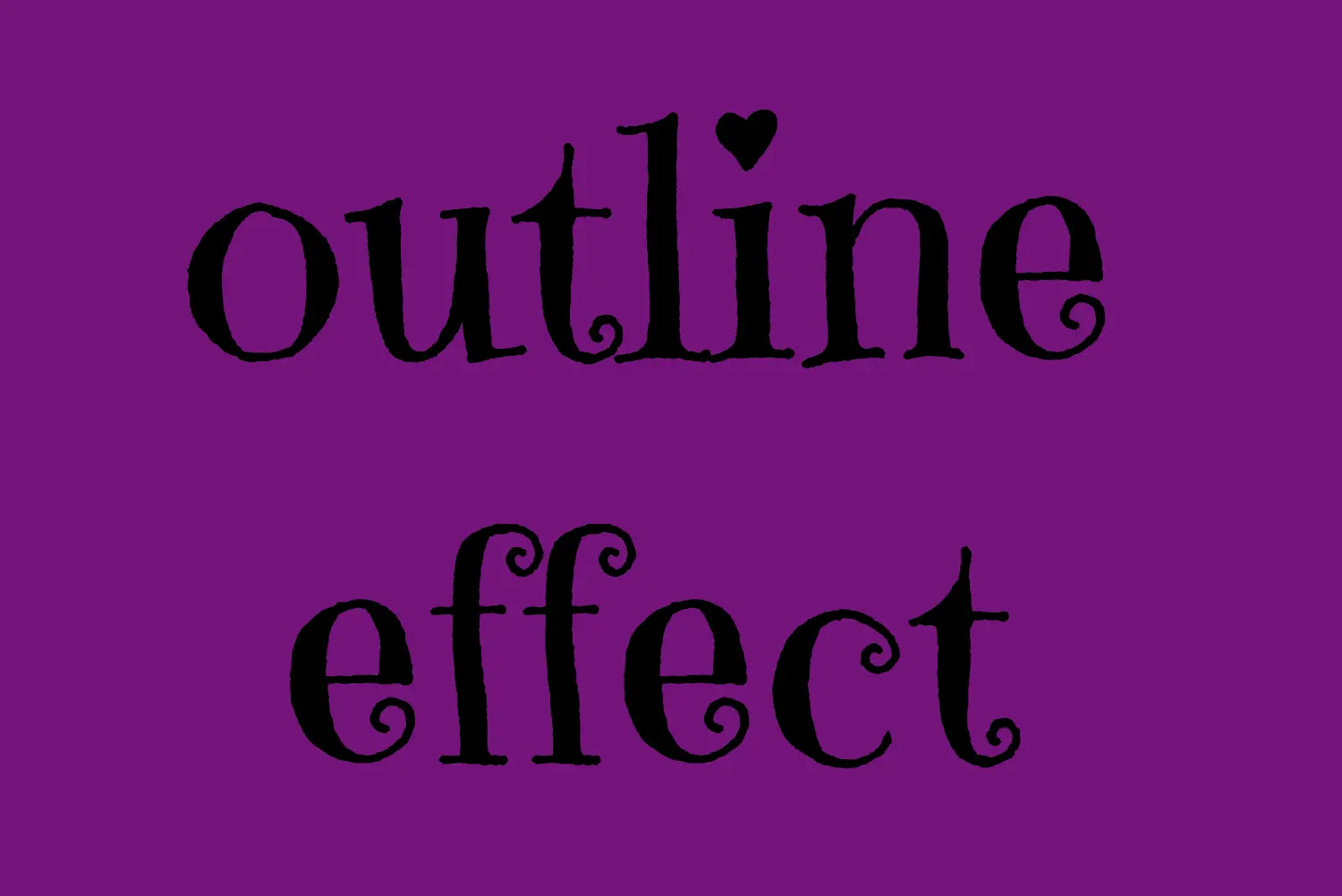
}Let’s see what we have done so far. I have chosen a vibrant purple color for our background while keeping the text in the default black color. Our text is set to 180px, perfectly aligned to the center.
To give a playful and lively vibe to our design, I’ve chosen the “Emilys Candy” font-family which adds a delightful touch. If you also intend to use this font family, importing it into your CSS file is essential. Ensure the @import statement is placed at the beginning of your CSS code snippet, just like I did (check above lines 2-4).
In the image below, you can see the current rendering on the screen up to this point.
Apply the CSS text outline effect#
.outline-effect {
  ...
  -webkit-text-stroke: 2px #8695e9; /* medium blue shade */
  color: transparent;
}
The first thing we have to do is set the -webkit-text-stroke property which represents a specific style line. (There is no unprefixed text-stroke — the -webkit- form is the one every browser actually supports.) Here, in our example, the text should have a light to medium blue color (#8695e9) outline with 2 pixels wide. Remember that as we increase the pixels, the outline becomes wider.
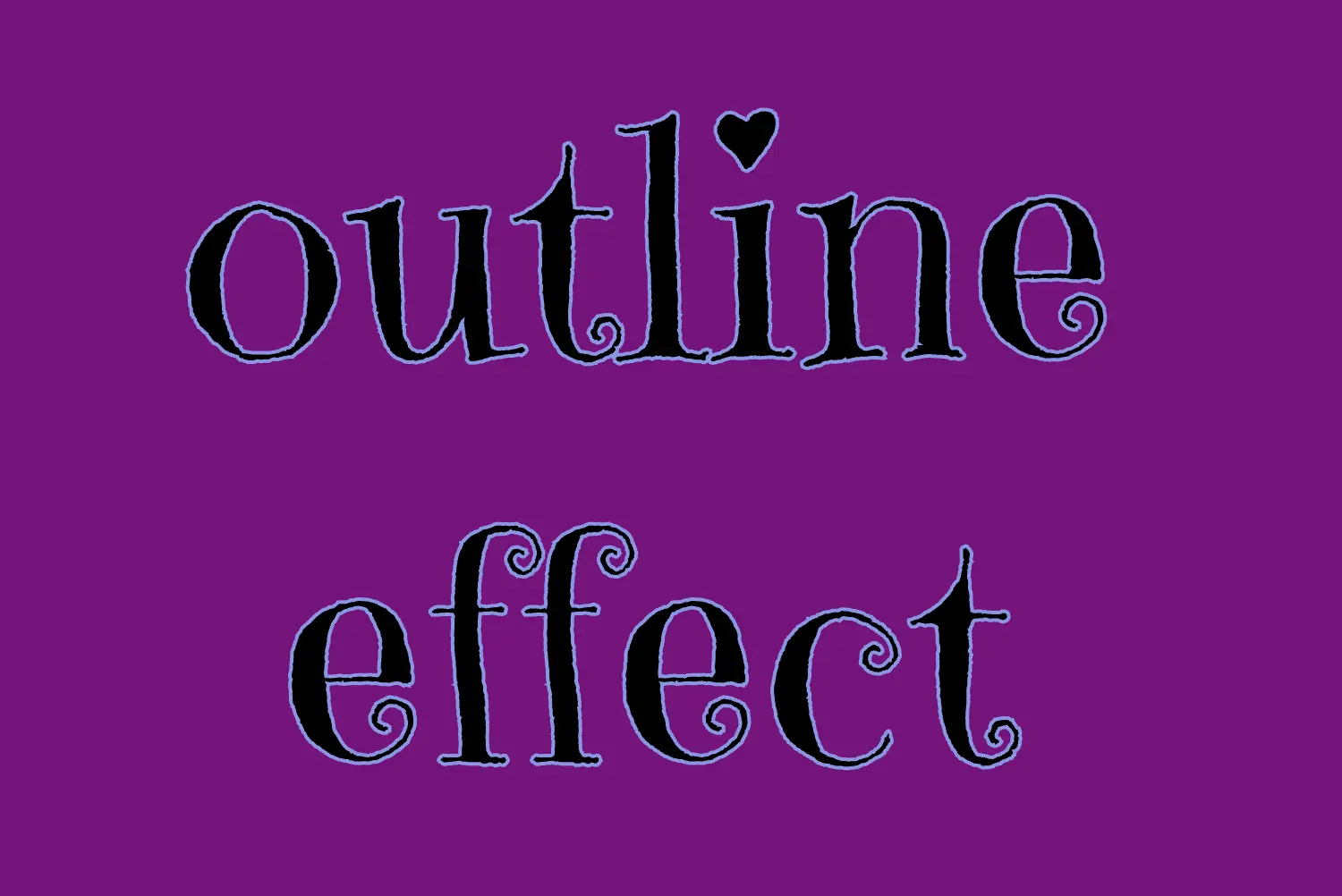
🔖 It’s useful to know that we can split the -webkit-text-stroke property in two: -webkit-text-stroke-width and -webkit-text-stroke-color.
/* 1st choice */
  -webkit-text-stroke: 2px #8695e9;

/* 2nd choice */
  -webkit-text-stroke-width: 2px;
  -webkit-text-stroke-color: #8695e9;
(Personally, I opt for the shortened form, saving time and extra lines of code, but the choice is yours. 🙂)
Finally, by adding color: transparent we complete our effect by allowing the background to show through.
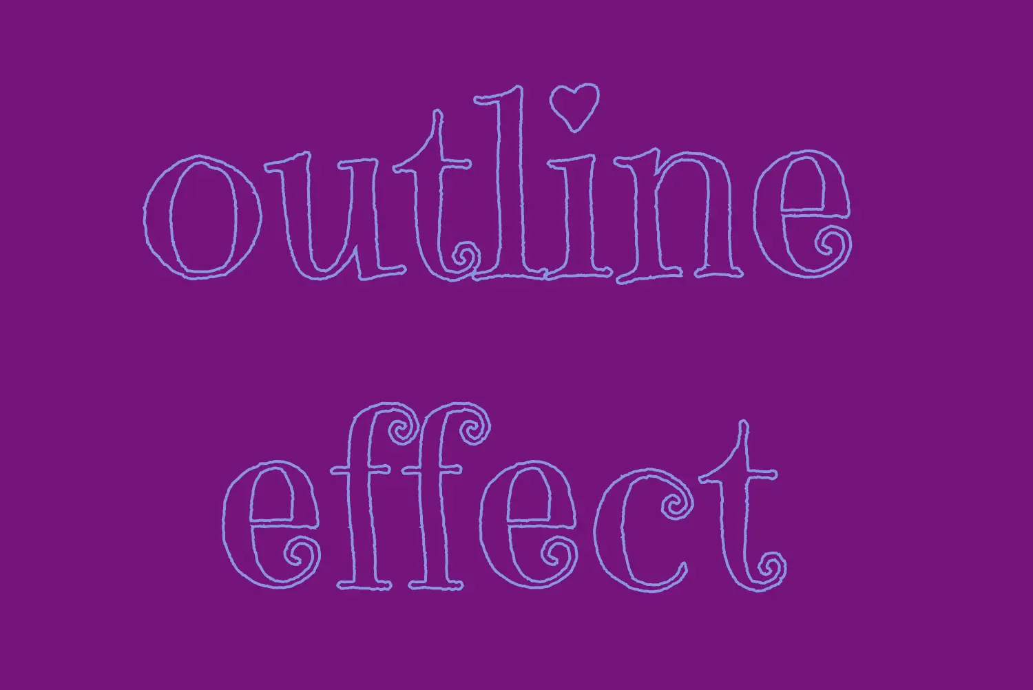
To sum up, this code styles a piece of text with a see-through center and a visible 2px blue outline. It’s simple yet impressive 🎈 ✨