

Hey there! In this post, I will show you how to create a pair of blinking eyes effect using only CSS (SCSS), complete with a smooth blinking animation to bring the eyes to life. A cow’s pair of eyes! Yes, yes, you read it right! We are dealing with a hidden 🐮 cow! Below, you can see our new 🐄 friend, with flesh and bones.
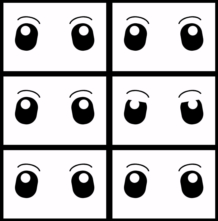
We are dealing with a hidden 🐮 cow!

HTML Structure#
Firstly, let’s build our blinking eyes’ initial structure using only HTML:
<div class="face">
  <div class="eye eye--left"></div>
  <div class="eye eye--right"></div>
  <div class="eyebrow eyebrow--left"></div>
  <div class="eyebrow eyebrow--right"></div>
</div>
CSS Structure#
Secondly, we continue by enhancing our HTML with CSS, starting from the body. We use flexbox as we want to place our face container in the center of our screen.
body {
  height: 100vh; // gives us the full screen-size height
  background-color: black;
  display: flex;
  align-items: center;
  justify-content: center;
}
CSS Face Structure#
Next, we add our face container styling in order to be ready for our eyes’ positioning. We set background-color: white; just for contrast since our eyes will be black. Afterward, we use display: grid; and place-items: center; because we want our container’s children, our eyes, to get centered.
.face {
  position: relative;
  width: 300px;
  height: 200px;
  background-color: white;
  display: grid;
  place-items: center;
}
Adding the eyes#
Afterward, we continue by creating our beautiful cow’s 👀 eyes.
.face {
  ...
  .eye {
    position: absolute;
    width: 64px;
    height: 80px;
    background-color: black;
    border-radius: 30px;
    overflow: hidden;
    &::before { // iris
      content: "";
      position: absolute;
      width: 28px;
      height: 28px;
      background-color: white;
      border-radius: 50%;
    } // end of before
    &--left { // position of left eye
      left: 200px;
      transform: rotate(-10deg);
      &::before { // position of left iris
        top: 8px;
        right: 12px;
      }
    }
    &--right { // position of right eye
      right: 200px;
      transform: rotate(10deg);
      &::before { // position of right iris
        top: 8px;
        left: 12px;
      }
    }
  } // end of eye
} // end of face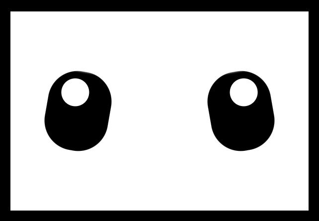
Adding the blinking animation#
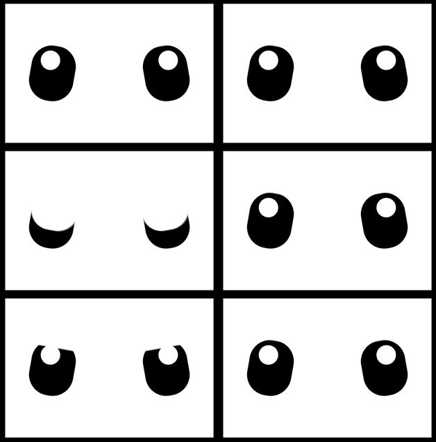
Now is the right time, drum 🥁 roll, to add our blinking animation 😉 .
.face {
  ...
  .eye {
    ...
    &::after { // eyelid
      content: "";
      position: absolute;

      /* takes the same width as the eye (width: 64px;)
      in order to cover the whole eye when blinking */
      width: 100%;
      /* we need 0 initial height - as our starting point before the
      animation runs */
      height: 0%;
      background-color: white;
      border-radius: 30px;
      box-shadow: 1px -2px 2px 2px white;

      /* here we add our "blink" animation since this is the
      html part (:after - blinking) we want to make animate.
      We want the animation to repeat every 4 seconds forever.
      */
      animation: blink 4s infinite ease-in;
    } // end of after
  } // end of eye
} // end of face

/* we name our animation "blink". We set different height percentages
as a way to set our eye lids STAY IN DIFFERENT PART each time */
@keyframes blink {
  0% {
    height: 0%;
  }
  30% {
    height: 0%;
  }
  33% {
    height: 100%;
  }
  40% {
    height: 0%;
  }
  70% {
    height: 0%;
  }
  75% {
    height: 100%;
  }
  78% {
    height: 0%;
  }
  81% {
    height: 100%;
  }
  84% {
    height: 0%;
  }
  100% {
    height: 0%;
  }
}
Hint 💡_Moreover, you should apply_ box shadow (check code above) to make the blinking eyelid overflow the eyes’ borders. This way during the blinking animation it will cover the whole eye and make it more realistic!
Adding the eyebrows#
Finally, we add the 🤨 eyebrows to complete the gaze.
.face {
  ...
  .eye {
    ...
  } /* end of eye */

  .eyebrow {
    position: absolute;
    width: 70px;
    height: 20px;
    border: solid 4px black;
    border-color: black transparent transparent transparent;
    border-radius: 50%/20px 20px 0 0;
    top: 40px;
    &--left {
      left: 40px;
      transform: rotate(10deg);
    }
    &--right {
      right: 40px;
      transform: rotate(-10deg);
    }
  } /* end of eyebrow */
} /* end of face */
Complete code solution#
Below is the full CSS code referenced in this blog post. Feel free to copy and use it in your projects.
body {
  height: 100vh; // gives us the full screen-size height
  background-color: black;
  display: flex;
  align-items: center;
  justify-content: center;
}

.face {
  position: relative;
  width: 300px;
  height: 200px;
  background-color: white;
  display: grid;
  place-items: center;
  .eye {
    position: absolute;
    width: 64px;
    height: 80px;
    background-color: black;
    border-radius: 30px;
    overflow: hidden;
    &::before { // iris
      content: "";
      position: absolute;
      width: 28px;
      height: 28px;
      background-color: white;
      border-radius: 50%;
    } // end of before
        &::after { // eyelid
      content: "";
      position: absolute;

      /* takes the same width as the eye (width: 64px;)
      in order to cover the whole eye when blinking */
      width: 100%;
      /* we need 0 initial height - as our starting point before the
      animation runs */
      height: 0%;
      background-color: white;
      border-radius: 30px;
      box-shadow: 1px -2px 2px 2px white;

      /* here we add our "blink" animation since this is the
      html part (:after - blinking) we want to make animate.
      We want the animation to repeat every 4 seconds forever.
      */
      animation: blink 4s infinite ease-in;
    } // end of after
    &--left { // position of left eye
      left: 200px;
      transform: rotate(-10deg);
      &::before { // position of left iris
        top: 8px;
        right: 12px;
      }
    }
    &--right { // position of right eye
      right: 200px;
      transform: rotate(10deg);
      &::before { // position of right iris
        top: 8px;
        left: 12px;
      }
    }
  } // end of eye
  .eyebrow {
    position: absolute;
    width: 70px;
    height: 20px;
    border: solid 4px black;
    border-color: black transparent transparent transparent;
    border-radius: 50%/20px 20px 0 0;
    top: 40px;
    &--left {
      left: 40px;
      transform: rotate(10deg);
    }
    &--right {
      right: 40px;
      transform: rotate(-10deg);
    }
  } /* end of eyebrow */
} // end of face

@keyframes blink {
  0% {
    height: 0%;
  }
  30% {
    height: 0%;
  }
  33% {
    height: 100%;
  }
  40% {
    height: 0%;
  }
  70% {
    height: 0%;
  }
  75% {
    height: 100%;
  }
  78% {
    height: 0%;
  }
  81% {
    height: 100%;
  }
  84% {
    height: 0%;
  }
  100% {
    height: 0%;
  }
}