Hello everybody! 😀 In this post, we’ll work with the amazing CSS border property, which is basically the line that surrounds our objects. Borders are an independent property and do not affect the content within. You can think of borders as beautiful frames that enclose HTML elements. ✨ 🖼 Let’s dive into the details of CSS border styles.
When working with borders in CSS, we have four key properties to consider:
border-widthborder-styleborder-colorborder-radius
Furthermore, we have the option to handle each side individually by using properties like border-top, border-right, border-bottom and border-left. You can also use an image or a gradient as the border with border-image-slice. We can either modify all four sides at once or selectively apply changes to different sides.
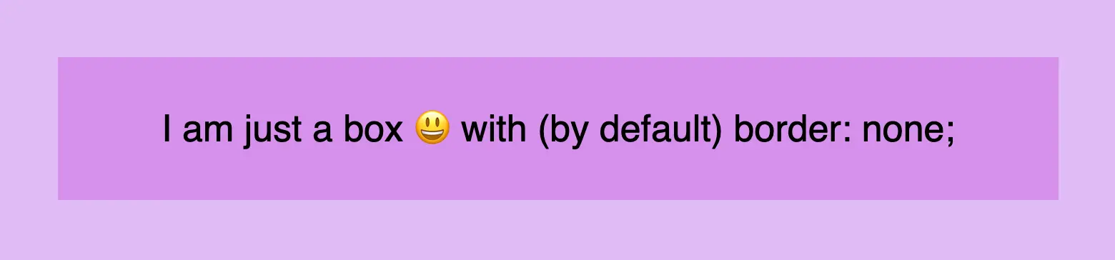
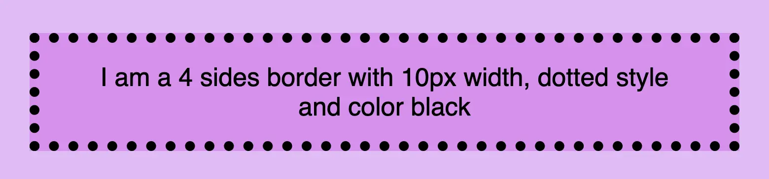
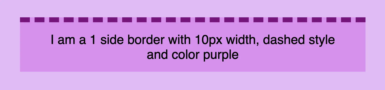
Below, there are some basic examples of borders so that you can have a quick glimpse of the possibilities offered by this CSS property. Afterward, we will go deeper and explore every case more analytically.
CSS border style – The playful property#
We can now move forward and focus on the first thing we need to know about borders is the border-style CSS property. There are many styles available, but for today, we will concentrate on the most common ones.
The first and most usual is the solid type which is just a simple line. Then we have the double which is as you’d expect a double line border. Another style is the dashed one in which, the line is made up of dashes. It’s nice to have clear and descriptive names right? Finally, the dotted style is the one in which the border line consists of dots.
Below, you will find examples showcasing the styles we’ve just mentioned alongside their respective CSS code:
border-style: solid;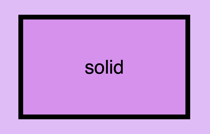
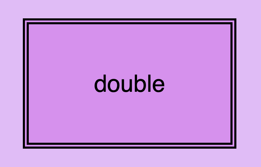
border-style: double;border-style: dashed;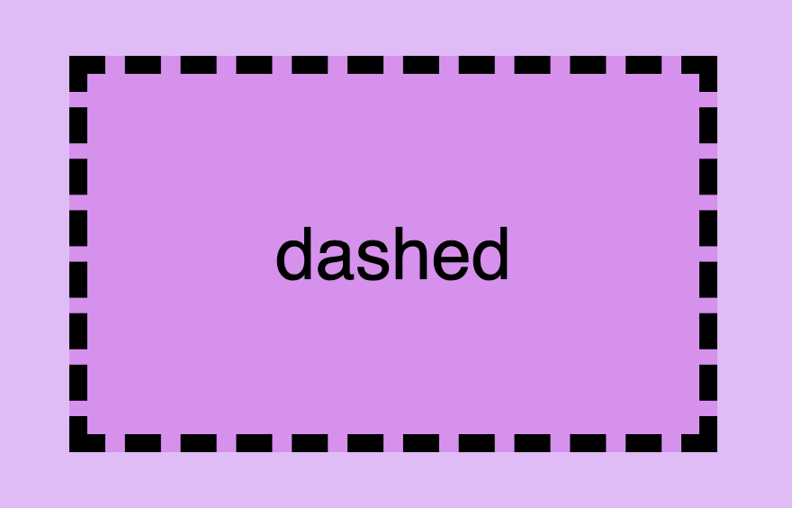
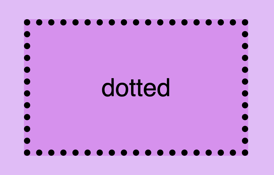
border-style: dotted;CSS border width – Focusing on precision#
Now that you’ve seen the basic border stylings, it’s time to check out the border’s width property. By default, border-width is medium — around 3px in most browsers — and nothing is drawn at all until border-style is set. To change the width, we modify the border-width property according to our needs.
Before we continue, it’s important to give you some insights on an important property that directly affects border behaviors and is called box-sizing. Box sizing’s value is set, by default, to content-box . Because of that borders occupy additional space around the objects they surround.
In simple words, if I have a box with 300px width and 200px height and I want to add a 20px border to all sides, then I will end up having a bordered box with 340px width and 240px height. Let’s see how I came up with this result:
width: ➡ 300px (box’s width) + 40px (20px border-left + 20px border-right) = 340px;
height: ➡ 200px (box’s height) + 40px (20px border-top + 20px border-bottom) = 240px;
border-width: 20px;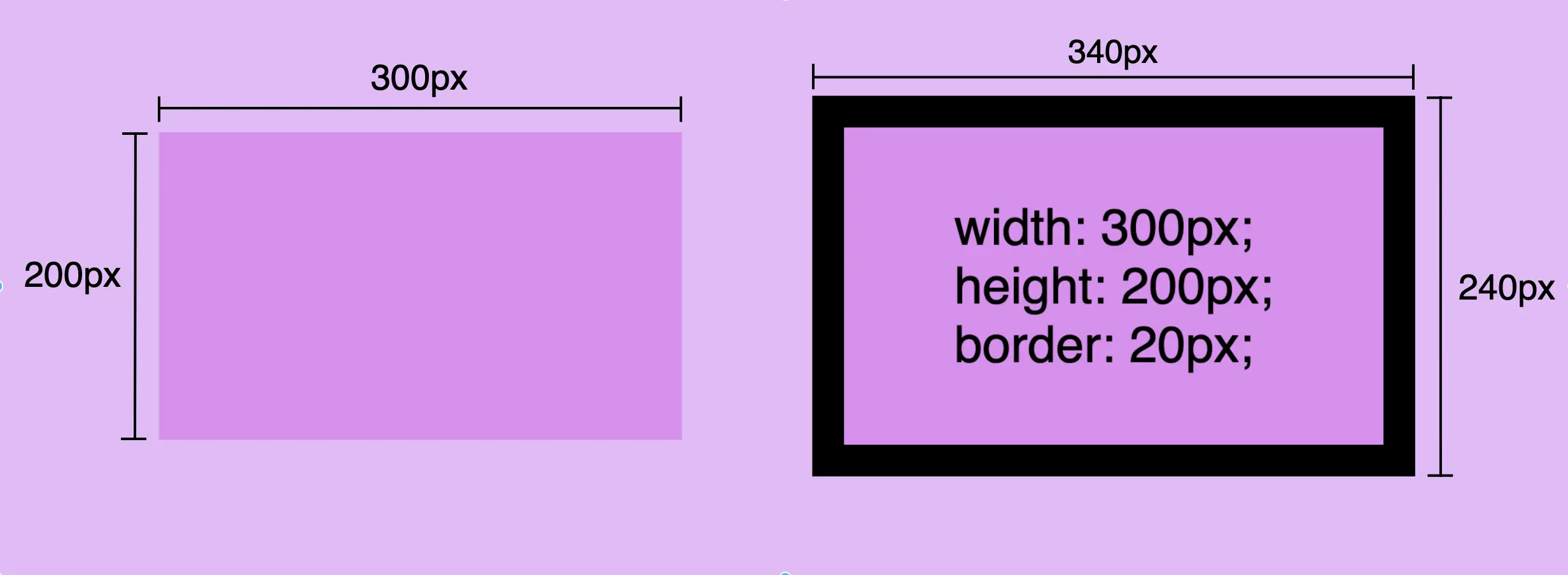
🕵️♀️ By exploring the box-sizing CSS property, we can include borders within the box’s dimensions. If you’re interested in learning more about it check out my post. You will find detailed instructions and explanations on each box sizing method.
CSS border color – For vivid results#
The next step is to understand how border color works. By default, border-color is currentColor, which means the border picks up the element’s own text color. Since text is black by default in most browsers, an unstyled border usually looks black too — but change the element’s color and the border changes with it.
By default, a border takes the element’s text color (
currentColor)
However, if we want a different color we have the freedom to choose any color we desire and simply assign it to the border-color property. Let’s see that in action:
border-color: blue;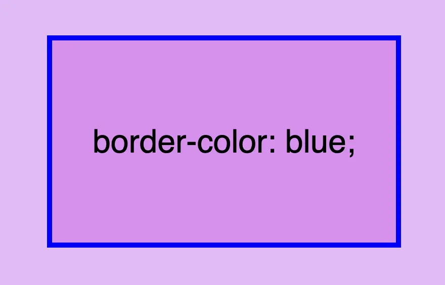
Border colors can be described using various different value types. For instance, you can specify the color blue by using :
- The word
blue - The corresponding hex code
#00F - The RGB value
rgb(0, 0, 255) - The HSL value
hsl(240, 100%, 50%)
A color 🌈 guide is also available to help expand your knowledge of colors.
Border shorthand for simplified stylings#
border: border-width border-style border-color
There is a cool method for writing all the above border properties that prove to be highly useful. By choosing this approach, you can set multiple values simultaneously. This technique is a super efficient way to define all border properties in a quick and easy manner. It’s a total time and space saver! 😃
Instead of listing each property separately, you just add each property side by side in a single line:
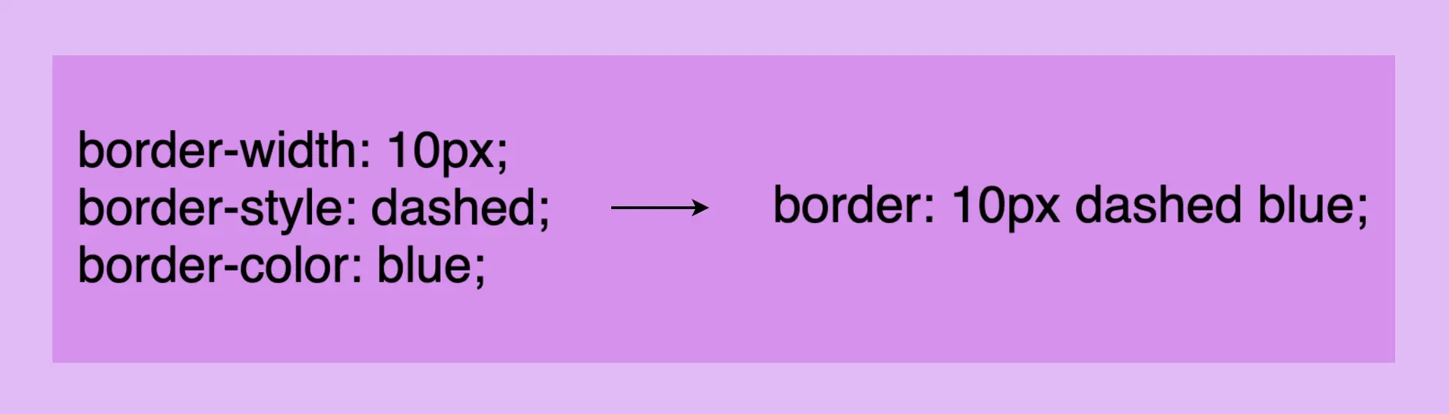
border: 10px dashed blue;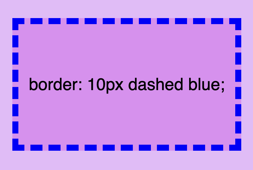
Cool right? 😎 ✨ Keep in mind that the order of the property doesn’t matter! We usually start with pixels and then add style and color, but it’s up to you the final decision!
CSS Border Styles for unique results#
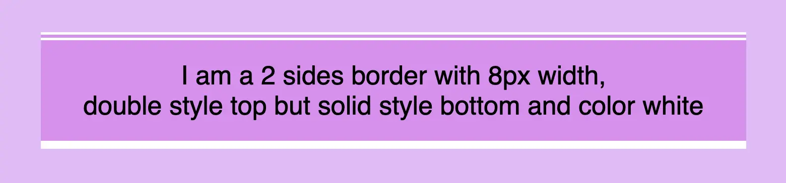
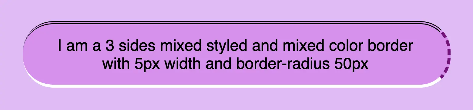
Additionally, we have the flexibility to selectively choose specific sides when defining our border styles. This allows us to create borders combined with different styling. In the following example, you can check out some of these combinations. But still, you are free to make your own! 😀
One side border#
border-top: 10px double white;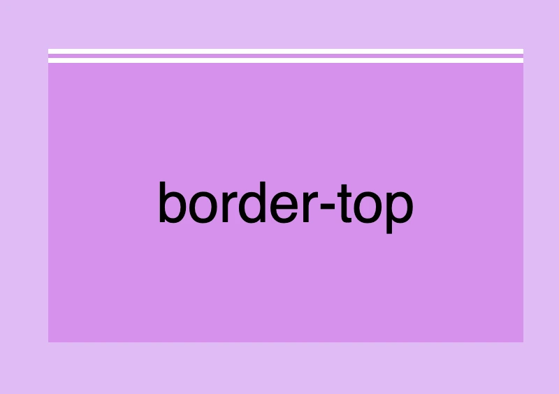
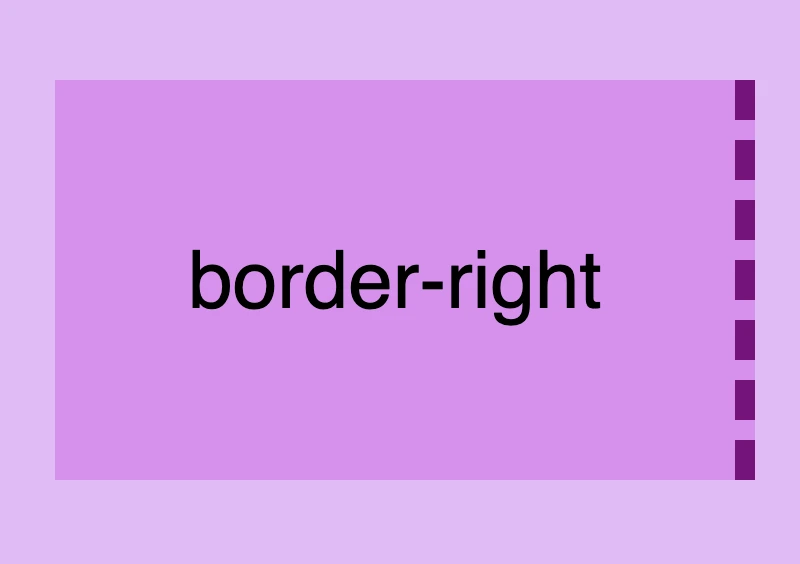
border-right: 10px dashed purple;border-bottom: 10px solid white;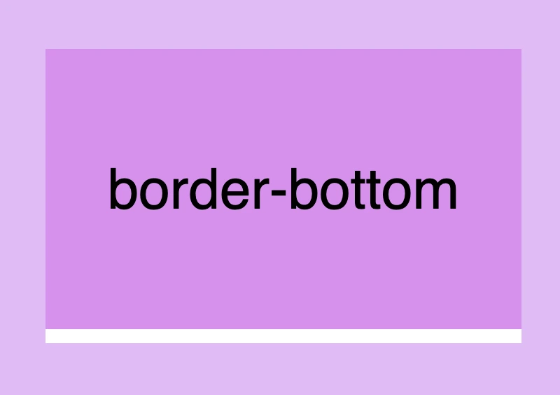
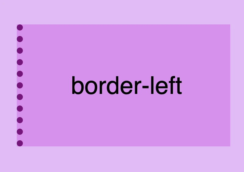
border-left: 10px dotted purple;Multiple sides border#
  border-top: 10px double white;
  border-right: none;
  border-bottom: 10px solid purple;
  border-left: none;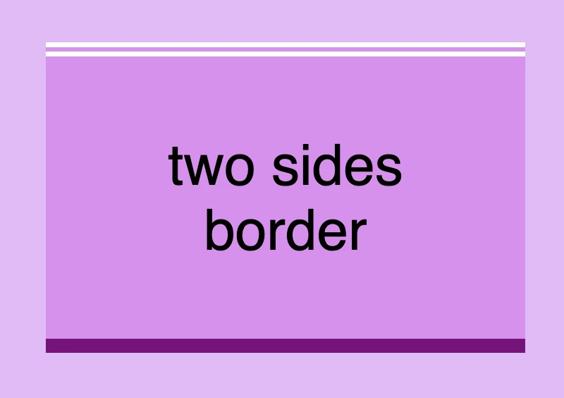
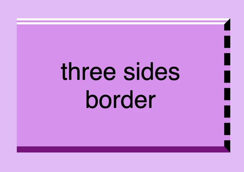
  border-top: 10px double white;
  border-right: 10px dashed black;
  border-bottom: 10px solid purple;
border-left: none; border-top: 10px double white;
border-right: 10px dashed black;
border-bottom: 10px solid purple;
border-left: 10px dotted blue;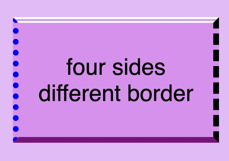
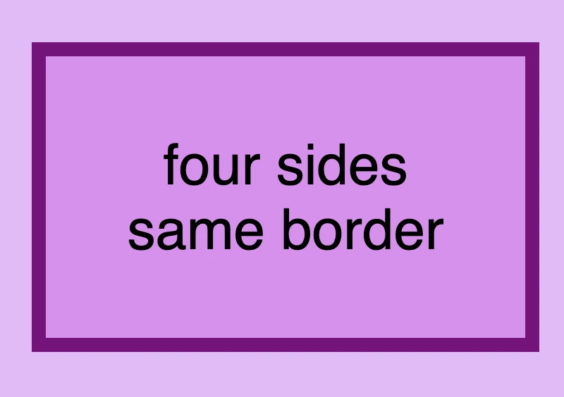
  border-top: 10px solid purple;
  border-right: 10px solid purple;
  border-bottom: 10px solid purple;
  border-left: 10px solid purple;
  /* OR */
  border: 10px solid purple;
🔖 Keep in mind when working with the CSS border property that it is considered a good practice to set equal border widths for all sides. Being consistent helps by bringing a sense of balance and distraction-free results. Furthermore, try to avoid mismatched styles and colors. Matching styles and colors lead to a smooth and cohesive look that’s easy on the eyes. Not to mention, it keeps your code cleaner 🎉 and easier to manage. 😀
DO’S#
  border-top: 10px solid white;
  border-right: 10px dashed purple;
  border-bottom: 10px solid white;
  border-left: 10px dashed purple;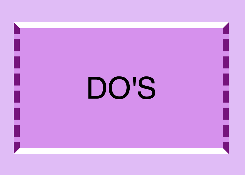
DON’TS#
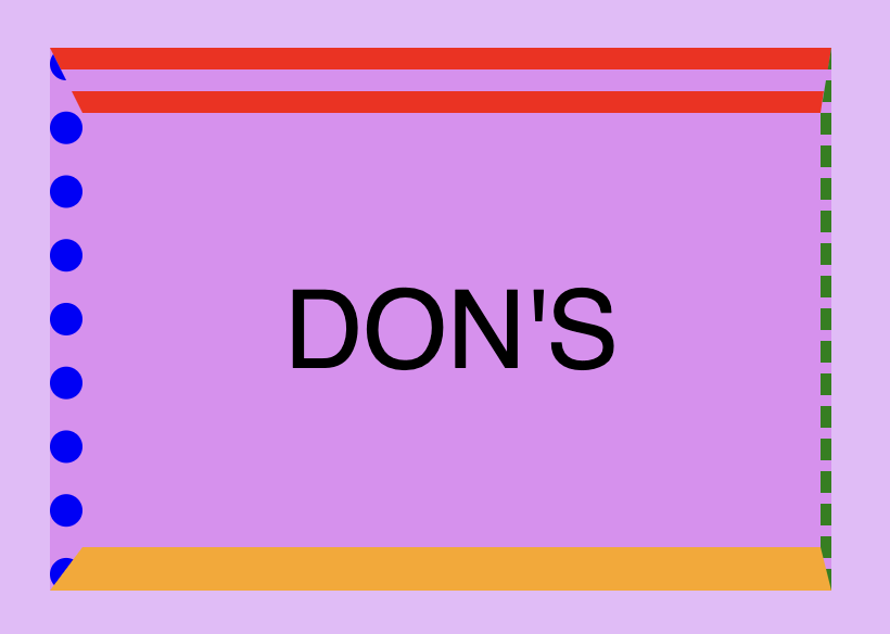
border-top: 30px double red;
border-right: 5px dashed green;
border-bottom: 20px solid orange;
border-left: 15px dotted blue;
Create curved corners using border-radius#
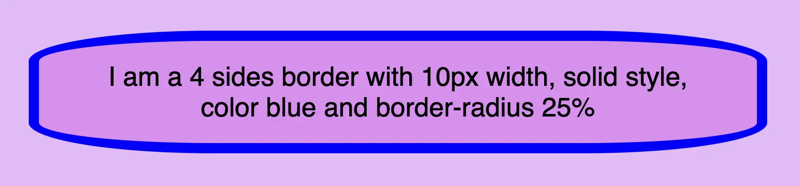
Last but not least we have the border-radius CSS property, which enables us to give our elements rounded corners. We can opt for uniform rounding or we can apply different degrees of rounding to each corner. In addition to that, it’s useful to know that when we are working with different radius per corner, we can also combine px with %.
When we are setting different border-radius per corner, we are free to combine px with %.
Same corners#
border-radius: 50%;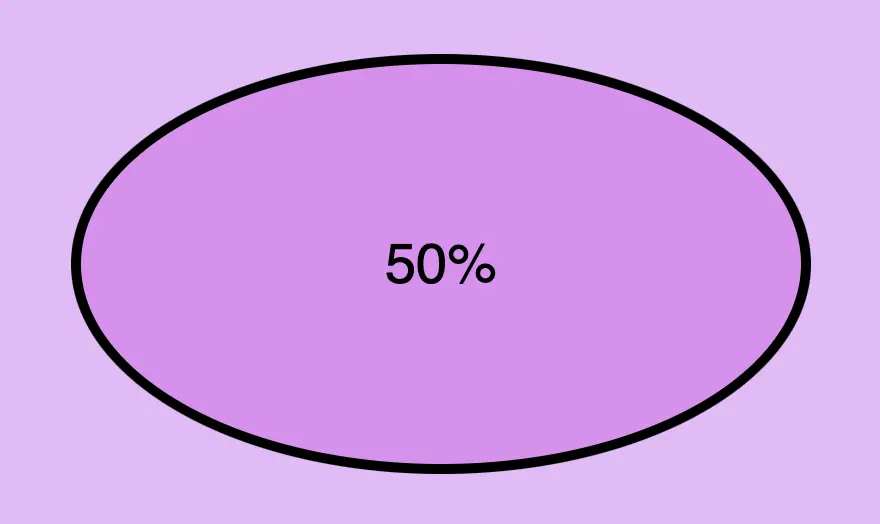
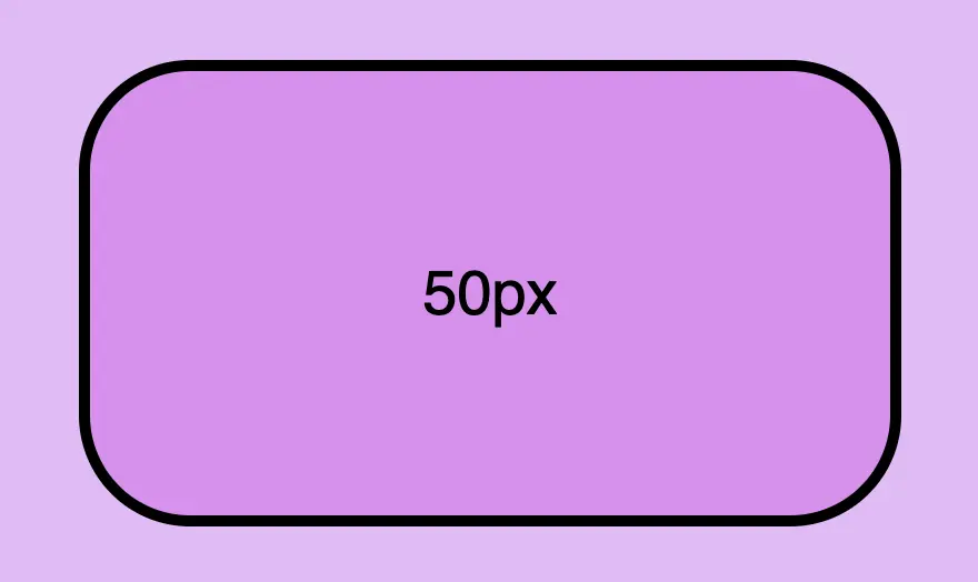
border-radius: 50px;Different corners#
/* top-left & bottom-right | top-right & bottom-left */
border-radius: 50% 25%;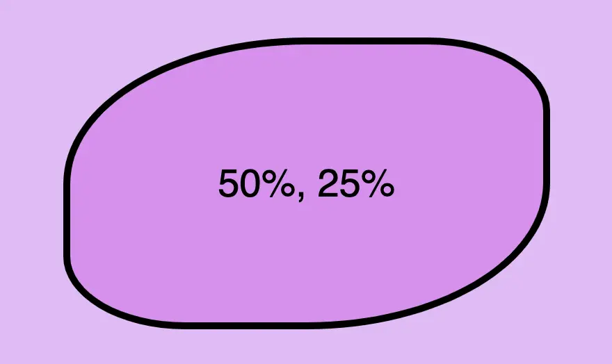
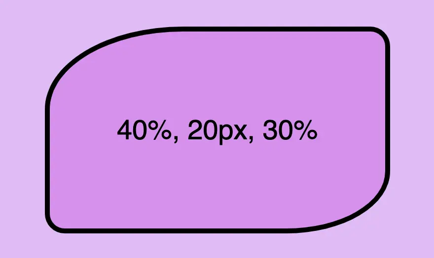
/* top-left | top-right & bottom-left | bottom-right */
border-radius: 40% 20px 30%;/* top-left | top-right | bottom-right | bottom-left */
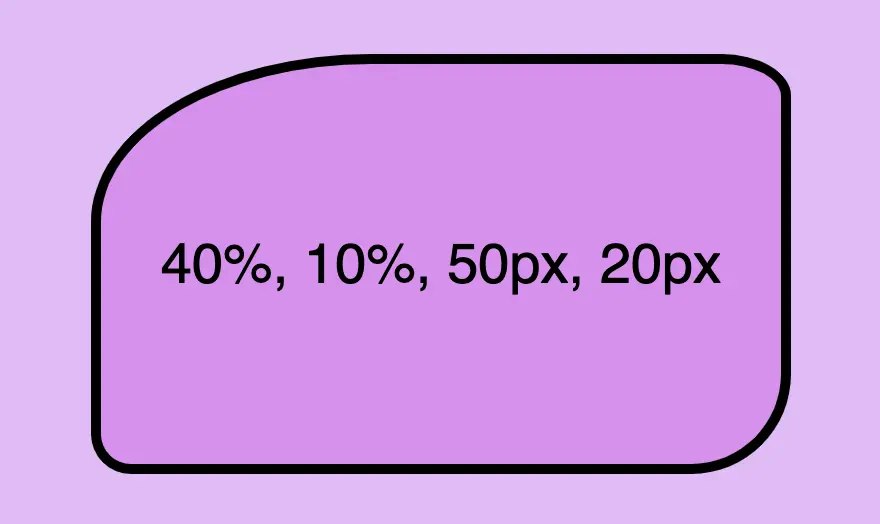
border-radius: 40% 10% 50px 20px;