

Greetings, all! 😃 I’m excited to share an incredible CSS technique with you today. We’ll learn little by little how to create impressive and rounded text. This technique can give our text a unique and captivating appearance that stands out from the usual. Get ready to take your text to the next level! 🧨 ⚡
Are you interested in learning how to uplevel your typography? Stick around to explore the endless possibilities of CSS and take your website to new heights! Let the game 🌀 begin and happy designing! 😊
HTML structure#
To create a text that appears in a rounded effect we begin with the HTML structure. First, we need an HTML div with a specific class. Let’s call it .wrapper. This div will be the container where the text will be displayed. To achieve the desired effect, we also need to add a span element for each character we want to use. By doing so, it allows us to handle and move each character separately and create the shape we want. 😉
In our example, we will use 15 letters and a star, so we need to add 16 spans. Each span represents a character. You can see the code snippet below for a better understanding.
<div class="wrapper">
  <span class="character1">I</span>
  <span class="character2">a</span>
  <span class="character3">m</span>
  <span class="character4">a</span>
  <span class="character5">r</span>
  <span class="character6">o</span>
  <span class="character7">u</span>
  <span class="character8">n</span>
  <span class="character9">d</span>
  <span class="character10">e</span>
  <span class="character11">d</span>
  <span class="character12">t</span>
  <span class="character13">e</span>
  <span class="character14">x</span>
  <span class="character15">t</span>
  <span class="character16-emoticon">⭐</span>
</div>
CSS structure#
We move forward with the CSS. We begin by styling the wrapper HTML element with a width and height of 400 pixels. It will also have a purple background-color, an inset magenta shadow (the inset box-shadow is a clever idea 💡 to create a distinctive boundary inside our wrapper, which will help us later with the positioning), and a border-radius of 50%, giving it a completely round shape. Finally, the flex method will perfectly align our text inside the wrapper.
Next, we will apply some styling to the spans within the wrapper. They will have a font-family: Arial (we need a really distinct font), a font-size of 40 pixels, and will be colored in a yellowish shade (#eddc42).
🔖 Note that we won’t add spaces between characters since we will place them one by one. By avoiding spaces, we can achieve precise and accurate positioning, which allows for greater control and flexibility in our design.
.wrapper {
  width: 400px;
  height: 400px;
  background-color: purple;
  box-shadow: inset 0 0 0px 60px magenta;
  border-radius: 50%;
  display: flex;
  align-items: center;
  justify-content: center;
}

 span {
  font-family: Arial;
  font-size: 40px;
  color: #eddc42;
}
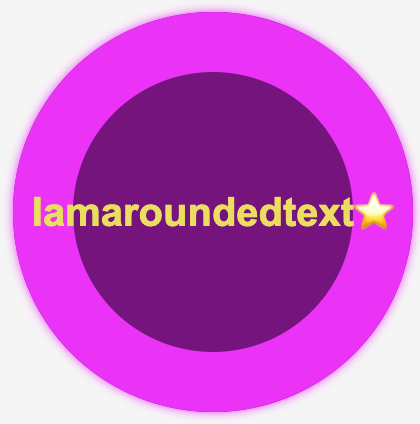
Below, we can see what is generated on the screen for now. Well, 🤔 in fact, I’m not a rounded text yet! 😃 So, let’s move on!
Preparation before starting to position the letters#
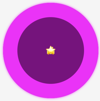
To be able to make the positioning, we set position: relative property to the wrapper and position: absolute property to the span as a way to move them freely. By doing so, all characters take the same place, but we can observe only the last one as it is on the top.
.wrapper {
  position: relative;
}

 span {
  position: absolute;
}
Now, we can see what is currently shown on the screen. While I’m not a looping message so far, 🤪 I will be soon! Let’s proceed. 😃
Creating the rounded shape#
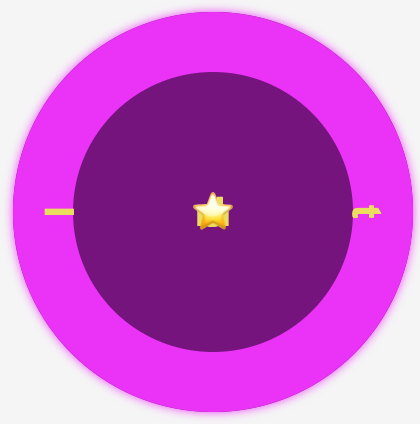
Starting from the two ends and going toward the middle side is a smart tactic to divide the space equally. Remember, we have a star that we will put in the center of the circle, so we do not count it. Thus, we initiate our positioning from the letters “I and t”, the first and last letter of our phrase, and place them in the middle of axis-Y by setting top: 50% and transform: translate(0, -50%).
Also, we keep the letters 40 pixels away from the left and right sides, with the left and right CSS properties respectively.
Finally, transforming our letters setting the transform: rotate() gives them a vibrant and dynamic perspective, bringing them to life in a truly inspiring way.
.character1 {
  left: 40px;
  top: 50%;
  transform: translate(0, -50%) rotate(-90deg);
}

.character15 {
  right: 40px;
  top: 50%;
  transform: translate(0, -50%) rotate(90deg);
}
Now, take a look at this sequence of characters. Notice how both the first and last letters are in their respective positions on the displayed screen. This is a good time to examine how the box-shadow CSS property helps us to count and place the characters accurately. 🟣 🤩 🟣 🤩 🟣
We move forward with this topic by counting the remaining characters. I know! I know! It can be a bit tricky and confusing 🤯 because of the counting, but the result will be amazing!! ✨ 🎉 Therefore, please ensure to maintain the positioning using the same tactic consistently. Finally, I’m including the rest of the code snippet below to complete my work.
.character2 {
    transform: rotate(-75deg);
    left: 38px;
    top: 144px;
  }

  .character3 {
    transform: rotate(-65deg);
    left: 42px;
    top: 113px;
  }

  .character4 {
    transform: rotate(-45deg);
    left: 80px;
    top: 68px;
  }

  .character5 {
    transform: rotate(-32deg);
    left: 120px;
    top: 42px;
  }

  .character6 {
    transform: rotate(-20deg);
    left: 140px;
    top: 32px;
  }

  .character7 {
    transform: rotate(-10deg);
    right: 208px;
    top: 25px;
  }

  .character8 {
    transform: rotate(5deg);
    right: 175px;
    top: 24px;
  }

  .character9 {
    transform: rotate(22deg);
    right: 145px;
    top: 30px;
  }

  .character10 {
    transform: rotate(30deg);
    right: 118px;
    top: 42px;
  }

  .character11 {
    transform: rotate(42deg);
    right: 90px;
    top: 60px;
  }

  .character12 {
    transform: rotate(65deg);
    right: 60px;
    top: 100px;
  }

  .character13 {
    transform: rotate(65deg);
    right: 45px;
    top: 122px;
  }

  .character14 {
    transform: rotate(80deg);
    right: 38px;
    top: 152px;
  }
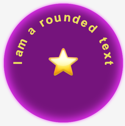
As we can see, all letters are in their respective positions on the displayed screen and our text is finally taking a rounded shape. 🟣 🤩 🟣 🤩 🟣
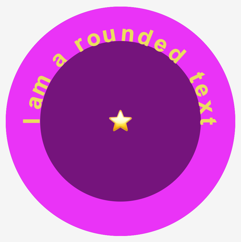
To finalize, it would be better if the star appears bigger so we modify the .character16-emoticon class and adjust the font-size property to 100px. Additionally, the box-shadow property needs to be updated to achieve the desired visual effect. Therefore, we will need to go back and make the necessary changes to ensure it looks exactly as we want it to.
.wrapper {
  ...
  box-shadow: inset 0 0 30px 10px magenta;
}

.character16-emoticon {
  font-size: 100px;
}
Tada! Our rounded text is ready! 🥳 💪 Enjoy! 🎊 🎊
Complete code solution#
Below is the full code referenced in this blog post. Feel free to copy and use it in your own projects. If you have any questions or encounter any issues, don’t hesitate to reach out for assistance. You can easily copy the desired code snippet by clicking on the copy icon, located in the top-right corner of each snippet.
<div class="wrapper">
  <span class="character1">I</span>
  <span class="character2">a</span>
  <span class="character3">m</span>
  <span class="character4">a</span>
  <span class="character5">r</span>
  <span class="character6">o</span>
  <span class="character7">u</span>
  <span class="character8">n</span>
  <span class="character9">d</span>
  <span class="character10">e</span>
  <span class="character11">d</span>
  <span class="character12">t</span>
  <span class="character13">e</span>
  <span class="character14">x</span>
  <span class="character15">t</span>
  <span class="character16-emoticon">⭐</span>
</div>* {
margin: 0;
padding: 0;
box-sizing: border-box;
}
html,
body {
height: 100vh;
}
body {
background-color: #f5f5f5;
display: flex;
align-items: center;
justify-content: center;
}
.wrapper {
width: 400px;
height: 400px;
background-color: purple;
box-shadow: inset 0 0 0px 60px magenta;
border-radius: 50%;
display: flex;
align-items: center;
justify-content: center;
}
span {
font-family: Arial;
font-size: 40px;
color: #eddc42;
}
.character1 {
left: 40px;
top: 50%;
transform: translate(0, -50%) rotate(-90deg);
}
.character2 {
transform: rotate(-75deg);
left: 38px;
top: 144px;
}
.character3 {
transform: rotate(-65deg);
left: 42px;
top: 113px;
}
.character4 {
transform: rotate(-45deg);
left: 80px;
top: 68px;
}
.character5 {
transform: rotate(-32deg);
left: 120px;
top: 42px;
}
.character6 {
transform: rotate(-20deg);
left: 140px;
top: 32px;
}
.character7 {
transform: rotate(-10deg);
right: 208px;
top: 25px;
}
.character8 {
transform: rotate(5deg);
right: 175px;
top: 24px;
}
.character9 {
transform: rotate(22deg);
right: 145px;
top: 30px;
}
.character10 {
transform: rotate(30deg);
right: 118px;
top: 42px;
}
.character11 {
transform: rotate(42deg);
right: 90px;
top: 60px;
}
.character12 {
transform: rotate(65deg);
right: 60px;
top: 100px;
}
.character13 {
transform: rotate(65deg);
right: 45px;
top: 122px;
}
.character14 {
transform: rotate(80deg);
right: 38px;
top: 152px;
}
.character15 {
right: 40px;
top: 50%;
transform: translate(0, -50%) rotate(90deg);
}
.character16-emoticon {
font-size: 100px;
}🌼 Hope you found my post interesting and helpful. Thanks for being here! 🌼