Simple Ways to Create a CSS Overlay Effect


Advertisement
On this page
Have you ever wanted to add cool effects to your website? With the CSS overlay effect, you can easily create stylish overlays to make your content stand out! Let’s see how it works!
What are overlay effects?
A CSS overlay effect is a powerful technique for placing an extra layer on top of your web content, typically an image or a background, to enhance its appearance or improve readability.
This effect allows you to create various visual enhancements, such as darkening an image or adding a color tint.
You can achieve overlays using the CSS background-color and background-image properties, enabling you to apply stunning visual effects to images. With these properties, you can easily modify the look and feel of your content, making it more engaging and visually appealing.
Let’s dive into an example to see how the CSS overlay effect works.
Basic HTML and CSS setup for a CSS overlay effect
First, we need to create an HTML element to hold our image and assign it a class. This class will contain all the necessary CSS rules to achieve the desired overlay effect.
<div class="overlay-container"></div>Next, we write the CSS for our class, setting a background image without repetition. This ensures the image fits nicely within a 400x600px box. With this setup, we can easily apply overlay effects or make further adjustments as needed.
.overlay-container {
  width: 400px;
  height: 600px;

  background-image: url('your-image-url-here');
  background-repeat: no-repeat;
  background-size: cover;
}At this stage, this is how our image appears on the screen.

Using pseudo-elements for the CSS overlay effect
A common technique for creating overlay effects is pseudoelements (:before and :after). To get this effect working, we have to prepare our class by setting position: relative. Then, we apply position: absolute to the :before pseudo-element. This ensures that :before is positioned relative to its parent — the overlay container.
We also use the content: "" declaration to make sure the pseudo-element is generated. In this case, the content remains empty since we want the image to be visible underneath.
Additionally, we set width: 100%; and height: 100%; to ensure the :before pseudo-element covers the entire area of its parent container, completely overlaying the image.
.overlay-container {
  ...
  position: relative;
}

.overlay-container:before {
  position: absolute;
  content: "";
  width: 100%;
  height: 100%;
}🔖 For the time being, nothing has changed on our screen; we just made the appropriate preparations for our effect. Let’s continue.


Applying the CSS overlay effect
Overlay effects come in various types, each adding a unique touch to our images. The CSS property that helps us to create this effect is background-image.
Below, I’ve created different variations for you to explore. 👩💻 Enjoy!
Using a linear gradient for the overlay effect
In the following CSS code snippet, you can see that the background-image property is set to linear gradient(...), creating a multi-color overlay effect with different transparency levels. This produces a smooth gradient overlay from top to bottom with shades of teal, yellow, and purple that make the perfect match for our image.
.overlay-container:before {
  ...
  background-image: linear-gradient(
    rgba(0, 255, 255, 0.3),
    rgba(255, 255, 0, 0.2),
    rgba(155, 0, 155, 0.2)
  );
}
Using a radial gradient for the overlay effect
We continue with a more creative approach. Here, radial gradient(...) creates a unique overlay effect using a circular pattern. It transitions from shades of light gray to dark gray, adding a subtle yet eye-catching touch to the image.
.overlay-container:before {
  ...
  background-image: radial-gradient(
    rgba(255, 255, 255, 0.1),
    rgba(128, 128, 128, 0.2),
    rgba(0, 0, 0, 0.6)
  );
}
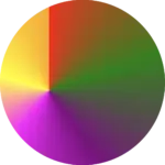
Creating a rainbow CSS overlay effect
Another vibrant and playful effect is the rainbow gradient. Often used for decorative purposes, this effect adds bright, joyful colors to the image, creating a fun and lively vibe. 🌈✨
When you apply this gradient as a background, it creates a smooth transition of colors from purple to red, mimicking the colors of a rainbow (ROYGBIV). The use of semi-transparent alpha values gives a soft blending effect between the colors, creating a visually appealing and harmonious overlay.
.overlay-container:before {
  ...
  background-image: linear-gradient(to bottom left,
    rgba(148, 0, 211, 0.5), rgba(75, 0, 130, 0.3),
    rgba(0, 0, 255, 0.2), rgba(0, 255, 0, 0.2),
    rgba(255, 255, 0, 0.3), rgba(255, 127, 0, 0.3),
    rgba(255, 0, 0, 0.3)
  );
}In this example, I changed my image to make the outcome clearer, adding a colorful vibe to create a playful atmosphere.


Adding a solid color CSS overlay effect
You are always free to use a single color as an overlay. In that case, we will apply the background-color CSS property to the :before pseudo-element.
.overlay-container:before {
  ...
  background-color: rgba(220, 135, 135, 0.2); /* pale pink */
}In this example, I kept the second image to make the outcome clearer. I’ve given it a softer, more romantic feel, where the pale pink color with the slight see-through effect adds a charming and gentle mood.


[lct id=”related-posts” postids=”4427,4393,7709,2803″]
🌼 Hope you found my post interesting and helpful.
Thanks for being here! 🌼
Never miss a tutorial
Practical coding tips delivered to your inbox every week.
No spam · Unsubscribe anytime
Advertisement