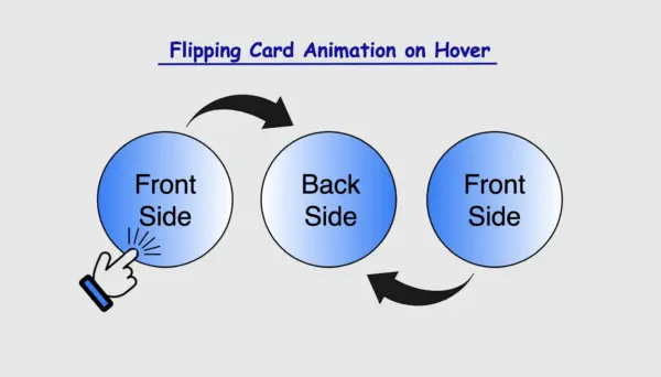
Greetings! Today, I’m excited to walk you through the steps of crafting an amazing CSS flipping card animation that will activate when the user hovers over it. By following my detailed guidance, you’ll learn how to create a stunning animated card that will grab the attention of your viewers and enhance the overall appearance of your website. So, don’t miss out! 😉
Let’s focus on making this unique animation!
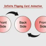
CSS Flipping card animation on hover
The provided HTML and SCSS (Sass) code creates a flip card that moves along the Y and X axis. The X-axis and Y-axis are two lines that cross each other. They’re used to define the location of a point in a two-dimensional space.
Let’s break down the code step by step:
Advertisement
HTML structure
To start, let’s focus on the HTML structure. We begin by creating a parent container with the class flip-wrapper. This container serves as the parent for our captivating animation. Inside this wrapper, we have a child element with the .flip-card class. This particular element is where our animation will take place.
<div class="flip-wrapper">
  <div class="flip-card"></div>
</div>CSS basic structure
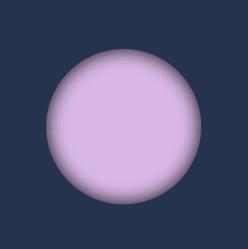
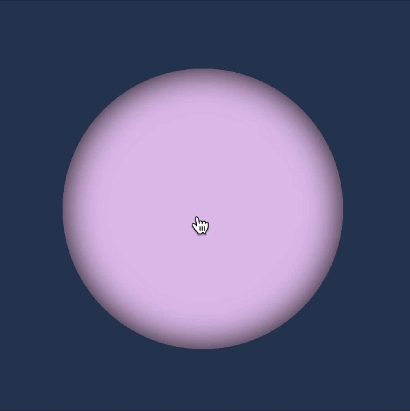
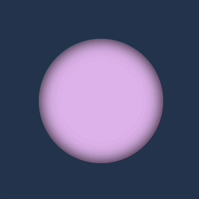
In our CSS code snippet, we start by setting the background-color of the entire page to a deep shade of dark blue (#213450).
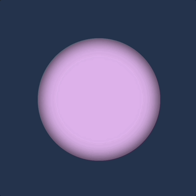
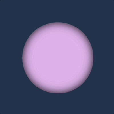
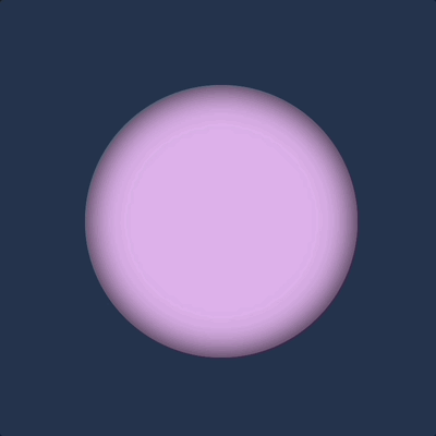
Moving on to the .flip-wrapper container, we specify its dimensions, giving it a fixed width and height of 300 pixels. To create a circular or rounded appearance, we apply border-radius. It’s worth noting that, if desired, you can leave the dimensions as is to maintain a square 🟪 shape. I chose this rounded 🟣 design because it makes it easier for us to observe the effect we’re aiming for. 😉
Next, we focus on the .flip-card element. We set its witdh and height to 100% to ensure it covers the entire available space. We also enhance its visual appeal with a soothing pastel purple (lavender) background-color and a subtle gray shadow effect. To maintain the circular theme, we add the inherit value to border-radius property.
body {
  background-color: #213450; /* dark blue */
}

.flip-wrapper {
  width: 300px;
  height: 300px;
  border-radius: 50%;
  .flip-card {
    width: 100%;
    height: 100%;
    background-color: #e1b6ea; /* lavender */
    box-shadow: inset 0 0 30px;
    border-radius: inherit;
  }
}This is what’s visible on our screen at the moment.
Advertisement
Ways to add the hover effect
For our effect to function as intended we have to work with both the parent and the child element. We begin with the parent element where we apply the :hover effect and change the cursor to a pointer 👆. You can check out all cursor style and pick the one that suits you best. 🤗
.flip-wrapper {
  ...
  &:hover {
    cursor: pointer;
  }
}
Next, we’ll move on to our child element. Here, we set the transform CSS property to rotateY and specify the degree (deg) of rotation we desire.
Afterward, we’ll define the transition CSS property. We can use it in two ways. We add it to the :hover or we can add it directly to the .flip-card class. In the first case, the effect works only when you hover in. In the second case, the effect works when you hover in, but when you hover out it turns back to its original position. Then we set the transform value and specify the duration in seconds (s). In our case, I’ve chosen 8 seconds to make the effect slow and easily observable. 😉
transform: rotateY()
hover-in
.flip-wrapper {
  ...
  &:hover {
    ...
    .flip-card {
      ...
      transform: rotateY(180deg);
      transition: transform 8s;
    }
  }
}
hover-in-out
.flip-wrapper {
  ...
  &:hover {
    ...
      transform: rotateY(180deg);
    }
    .flip-card {
      transition: transform 8s;
    }
  }
}
transform: rotateX()
We do the same, but this time along axisX.
hover-in
.flip-wrapper {
  ...
  &:hover {
    ...
    .flip-card {
      ...
      transform: rotateX(360deg);
      transition: transform 8s;
    }
  }
}
hover-in-out
.flip-wrapper {
  ...
  &:hover {
    ...
      transform: rotateX(360deg);
    }
    .flip-card {
      transition: transform 8s;
    }
  }
}
We have the capability to create rotations along both the Y and X axes at the same time.
Advertisement
transform: rotateX() rotateY()
hover-in
.flip-wrapper {
  ...
  &:hover {
    ...
    .flip-card {
      ...
      transform: rotateX(180deg) rotateY(180deg);
      transition: transform 8s;
    }
  }
}
hover-in-out
.flip-wrapper {
  ...
  &:hover {
    ...
      transform: rotateX(180deg) rotateY(180deg);
    }
    .flip-card {
      transition: transform 8s;
    }
  }
}
🌼 Hope you found my post interesting and helpful.
Thanks for being here! 🌼

Great content, thanks for posting.