Have you ever wondered if you can create all these directional signs (⬆,↙, etc.), you see everywhere around, using only CSS? I have the solution for you! What about exploring the unique clip-path CSS property, where you can create complex shapes following specific movements!
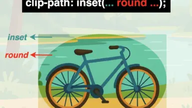
The clip-path property allows us to cut ✂ an element to a shape of our choice by specifying a series of points. It takes many values, but in our case, we will use the clip-path: polygon() function. I’ll briefly note circle(), ellipse(), and inset() which are the rest of the functions. In this post, we will analyze how we can create navigation signs only.
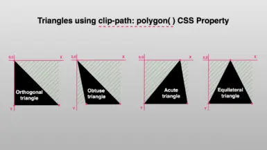
Clip-path: polygon() function explained
It would be an excellent start to examine the syntax of this amazing tool. Below I’ve illustrated the code along with explanatory diagrams.
The first one shows how we can make a square setting the clip-path: polygon() function. We used to create square shapes ⬛ by simply setting the width and height CSS properties. However, I opted to use the clip-path to utilize its familiarity and improve clarity. 😎
I used colored code to show you how we measured on both the axis-X and axis-Y. Each pair of values represents a point, with the first value indicating the horizontal position and the second value indicating the vertical position. Then an image accompanied the code and display a series of colored points illustrate how we form our visual element.
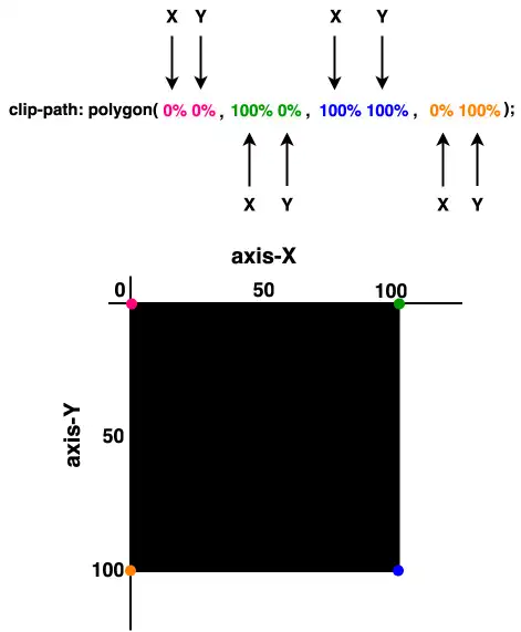
“Clip-path is extremely flexible. We can create any shape we desire from scratch, but we can also apply it to existing shapes and create transformations of our choice”.
Advertisement
The second case shows how we can transform the square into a directional sign that points to the top. Again, the clip-path: polygon function is defined by coordinates relative to the element’s bounding box, but this time it is a bit harder. 🤯 Don’t worry, I am here to clarify for you! 🤓
- It starts at the top-middle
(50% 0%). - Then it moves diagonally down and right
(70% 25%). - From there, it continues straight down
(70% 100%)where it turns diagonally again for two times in a row. - First up and left
(50% 75%), then down and left(30% 100%). - Finally, it moves straight up
(30% 25%)where it completes its movements.
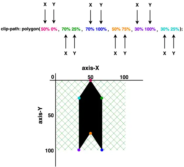
These one-direction moves enable you to create complicated shapes by strategically placing each point to outline the desired polygonal form. This method allows for precise control over the path of the shape, facilitating the design of visually appealing and geometrically complex elements on web pages.

Ready-to-copy code snippets
Below, I have prepared ready-to-copy code for directional signs. Feel free to use it everywhere you need. Enjoy! 🎊
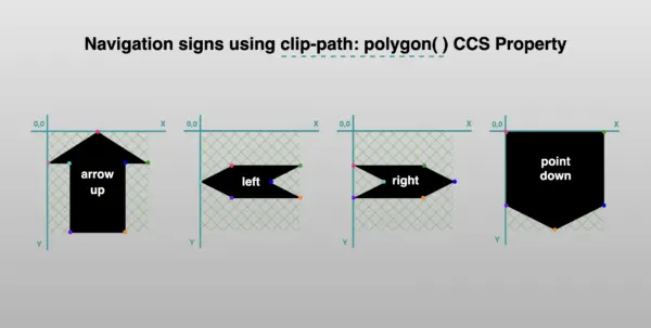
Directions
Ready code and explanation diagrams for directions.
Direction to Up
clip-path: polygon(
           50% 0%,
           70% 25%,
           70% 100%,
           50% 75%,
           30% 100%,
           30% 25%);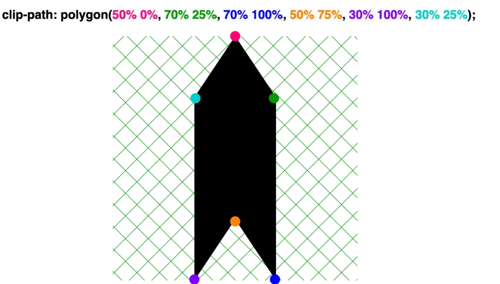
Direction to Down
clip-path: polygon(
           30% 0%,
           50% 25%,
           70% 0%,
           70% 75%,
           50% 100%,
           30% 75%);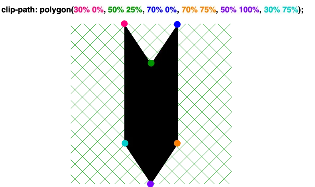
Direction to the Left
clip-path: polygon(
           25% 30%,
           100% 30%,
           75% 50%,
           100% 70%,
           25% 70%,
           0% 50%);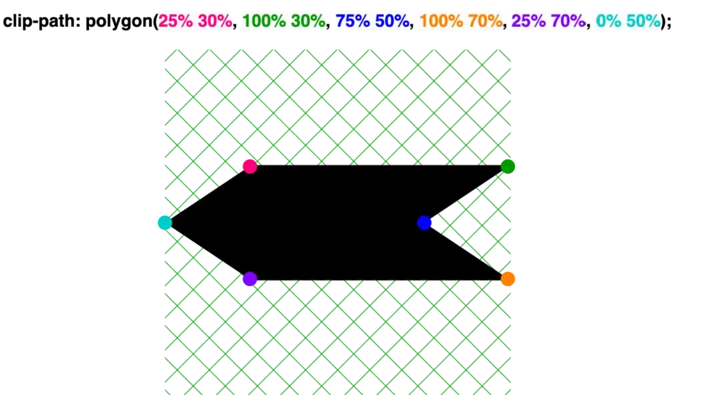
Direction to the Right
clip-path: polygon(
           0% 30%,
           75% 30%,
           100% 50%,
           75% 70%,
           0% 70%,
           25% 50%);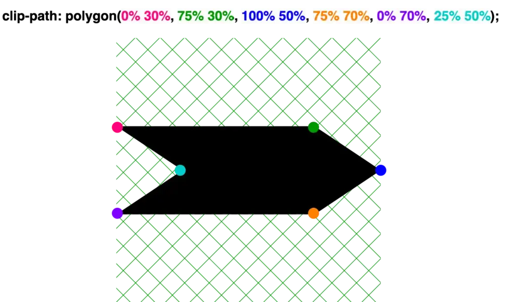
🔖 We are always free to skip all these signs and create just one, 😇 to show only one direction, then we can rotate it until it aligns with our preferences.
Advertisement
Arrows
Ready code and explanation diagrams for arrows.
Arrow up
clip-path: polygon(
           50% 0%,
           100% 25%,
           75% 25%,
           75% 100%,
           25% 100%,
           25% 25%,
           0% 25%);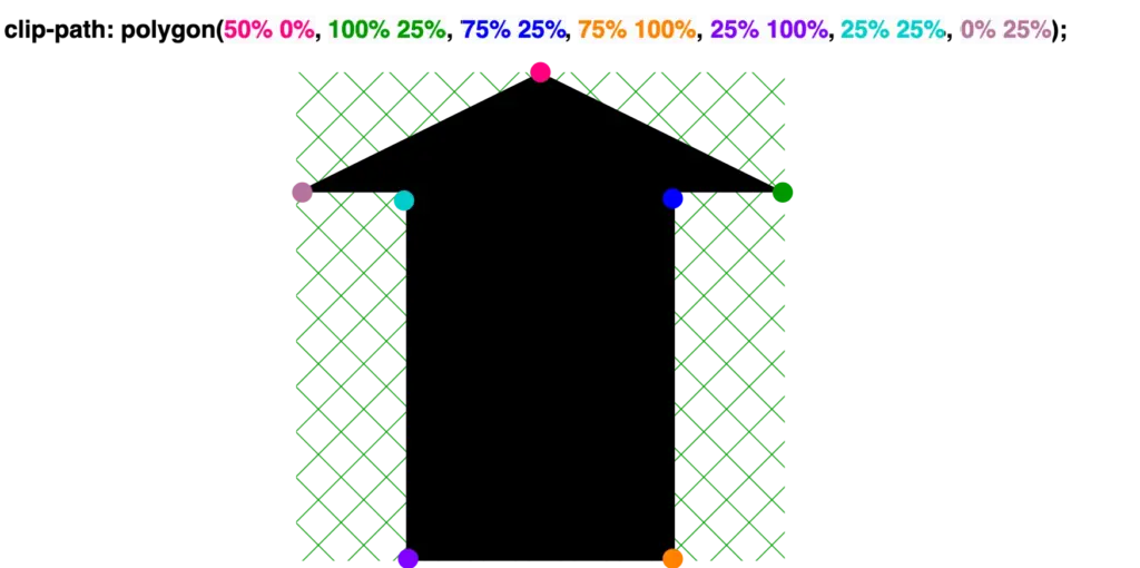
Arrow down
clip-path: polygon(
           25% 0%,
           75% 0%,
           75% 75%,
           100% 75%,
           50% 100%,
           0% 75%,
           25% 75%);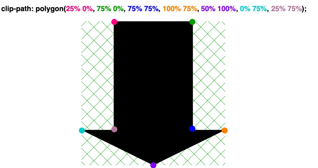
Arrow to the left
clip-path: polygon(
           25% 0%,
           25% 20%,
           100% 20%,
           100% 80%,
           25% 80%,
           25% 100%,
           0% 50%);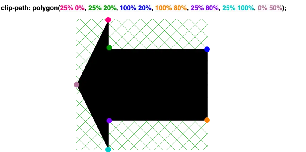
Arrow to the right
clip-path: polygon(
           75% 0%,
           100% 50%,
           75% 100%,
           75% 80%,
           0% 80%,
           0% 20%,
           75% 20%);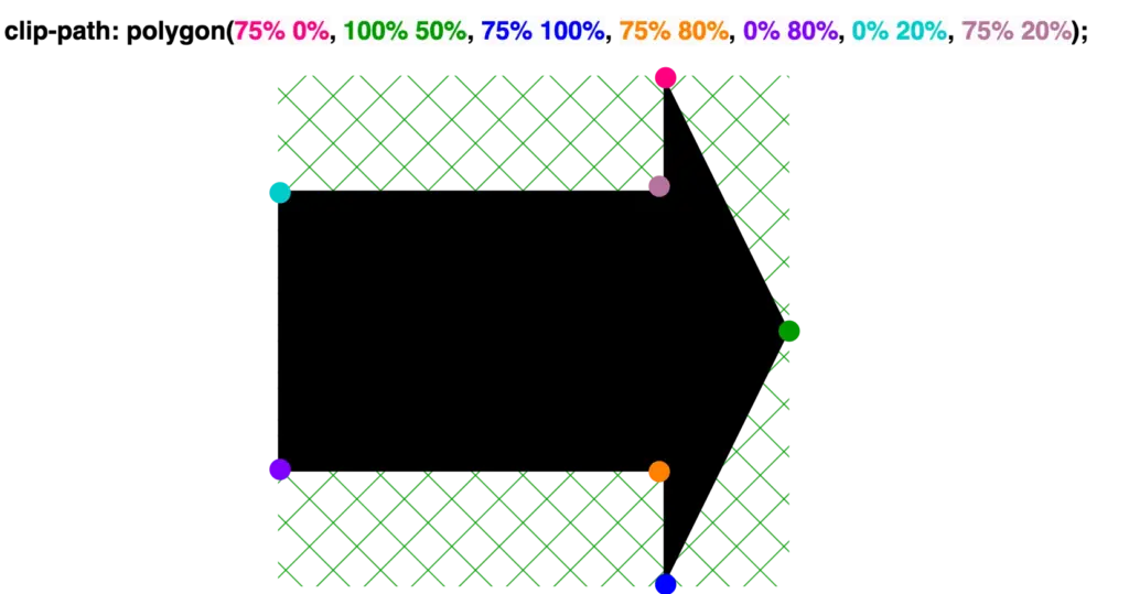
Points
Ready code and explanation diagrams for points.
Point up
clip-path: polygon(
           50% 0%,
           100% 25%,
           100% 100%,
           0% 100%,
           0% 25%);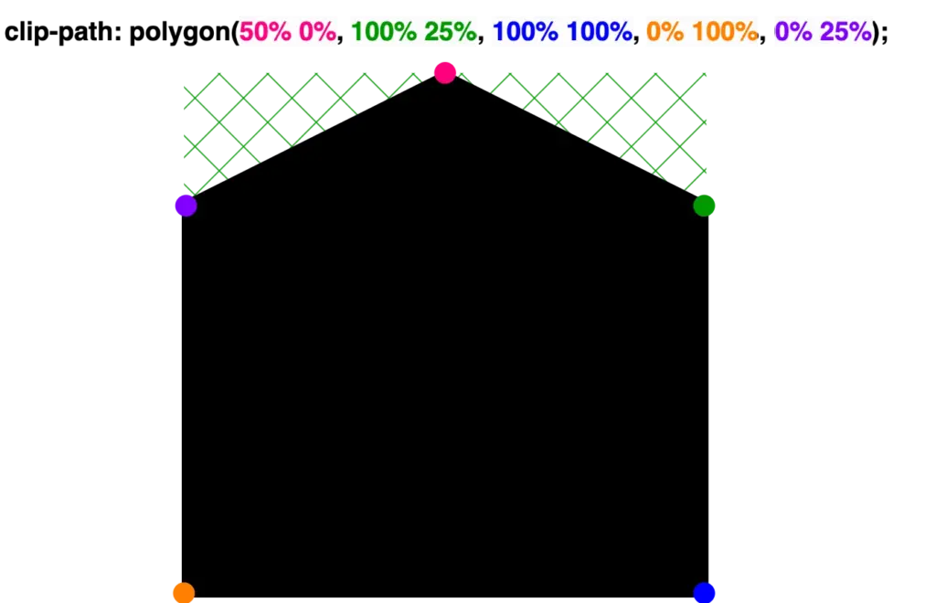
Point down
clip-path: polygon(
           0% 0%,
           100% 0%,
           100% 75%,
           50% 100%,
           0% 75%);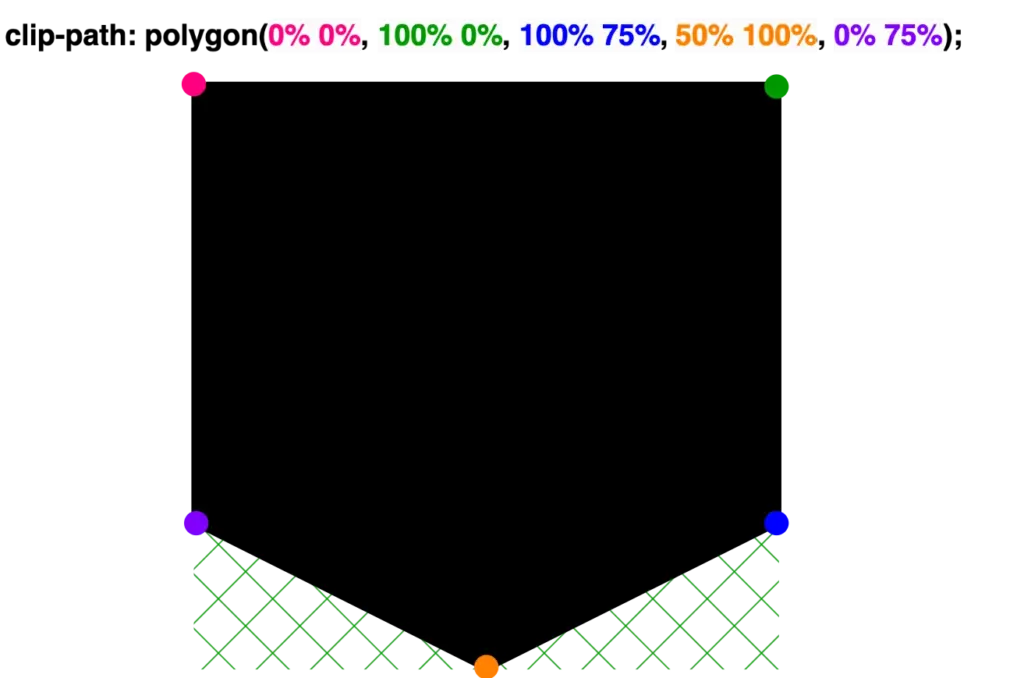
Point left
clip-path: polygon(
           25% 0%,
           100% 0%,
           100% 100%,
           25% 100%,
           0% 50%);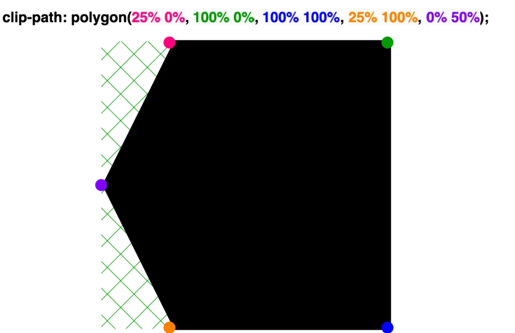
Point right
clip-path: polygon(
           0% 0%,
           75% 0%,
           100% 50%,
           75% 100%,
           0% 100%);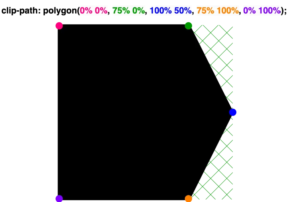

Leave a reply