Welcome! Today we’ll dig ⛏ deep and dive into geometric layouts exploring the fascinating clip-path CSS property. This amazing tool helps us to define specific regions within an element, allowing creative shape manipulation. We declare specific points based on the shape we intend to create, offering precise control over our work preferences and needs.
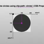
Clip-path CSS property supports several shapes. Depending on the shape we want to create we have the following options: circle(), ellipse(), inset(), and polygon(). In today’s post we’ll spend time on clip-path: polygon() as this anables us to clip an element into a polygon shape.
Clip-path polygon() function explained
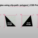
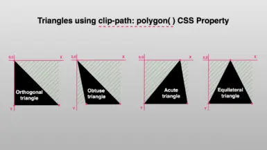
To illustrate the clip-path: polygon() CSS property I chose to start with a square, as it is the most common type of polygon.
Below, we can see the code marked with colors. Each pair of values, inside the parentheses, symbolizes a point. In our case, we have four pairs of values, hence we have a shape with four points (square).
The four color points represent the clipping area and display how we position the square on both axes X and Y.
/* square */
clip-path: polygon(
           0% 0%,
           100% 0%,
           100% 100%,
           0% 100%);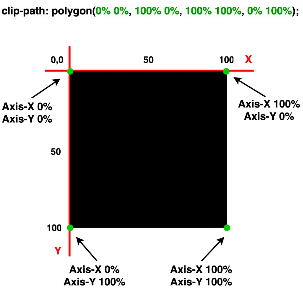
Below is ready-to-copy code for polygons. Feel free to use it wherever you need! 🤗
Advertisement

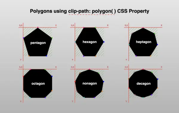
Create pentagon
/* pentagon */
clip-path: polygon(
           50% 0%,
           100% 40%,
           80% 100%,
           20% 100%,
           0% 40%);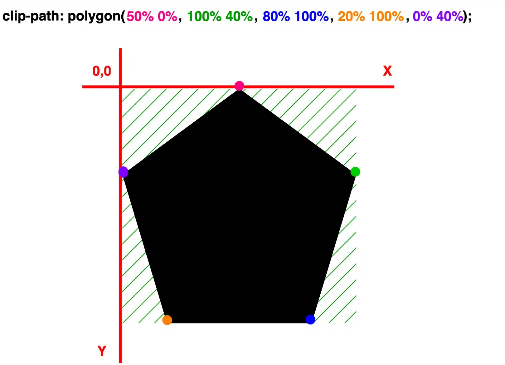
/* pentagon oriented downward */
clip-path: polygon(
           20% 0%,
           80% 0%,
           100% 60%,
           50% 100%,
           0% 60%);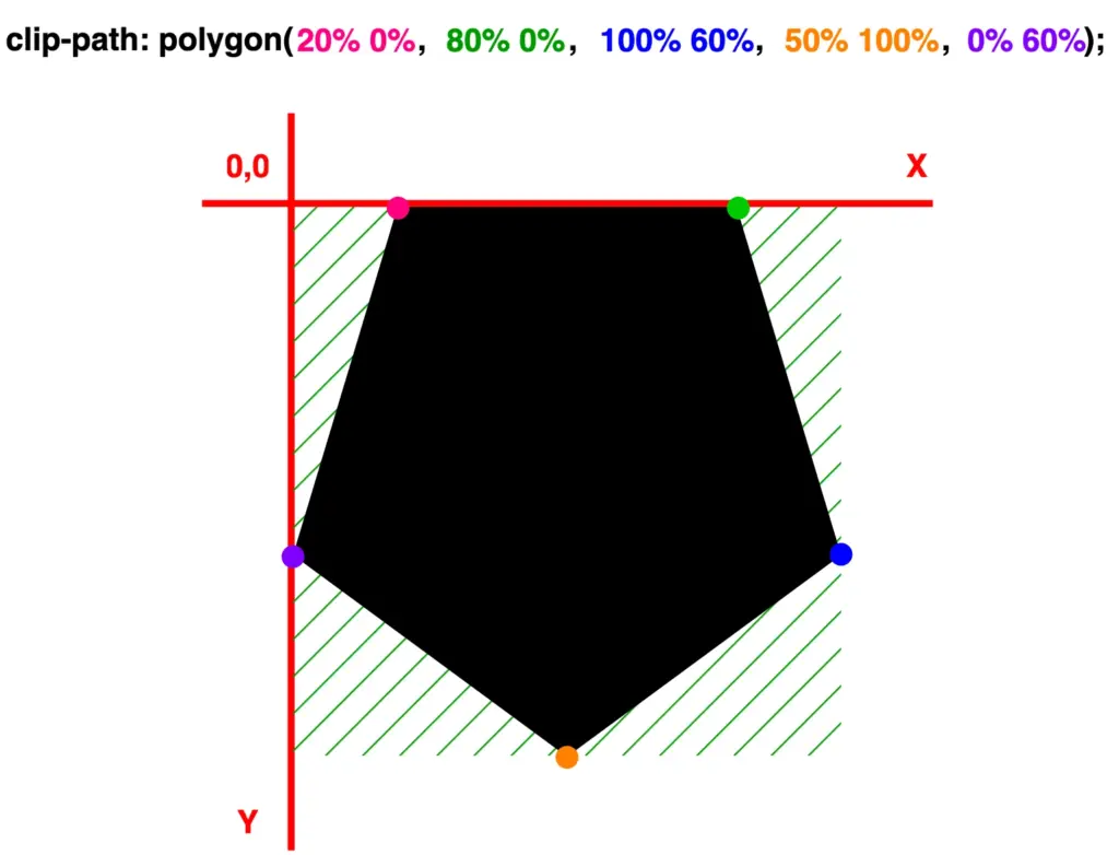
Create hexagon
/* hexagon vertical */
clip-path: polygon(
           25% 0%,
           75% 0%,
           100% 50%,
           75% 100%,
           25% 100%,
           0% 50%);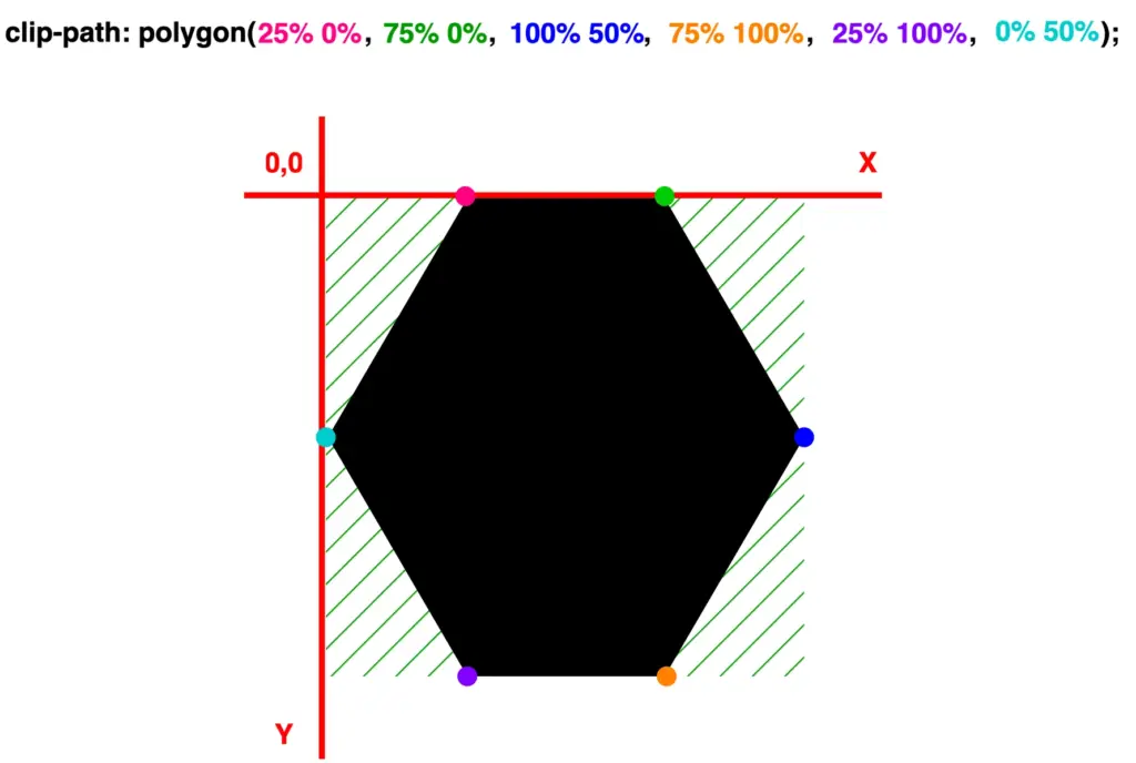
/* hexagon horizontal */
clip-path: polygon(
           50% 0%,
           100% 25%,
           100% 75%,
           50% 100%,
           0% 75%,
           0% 25%);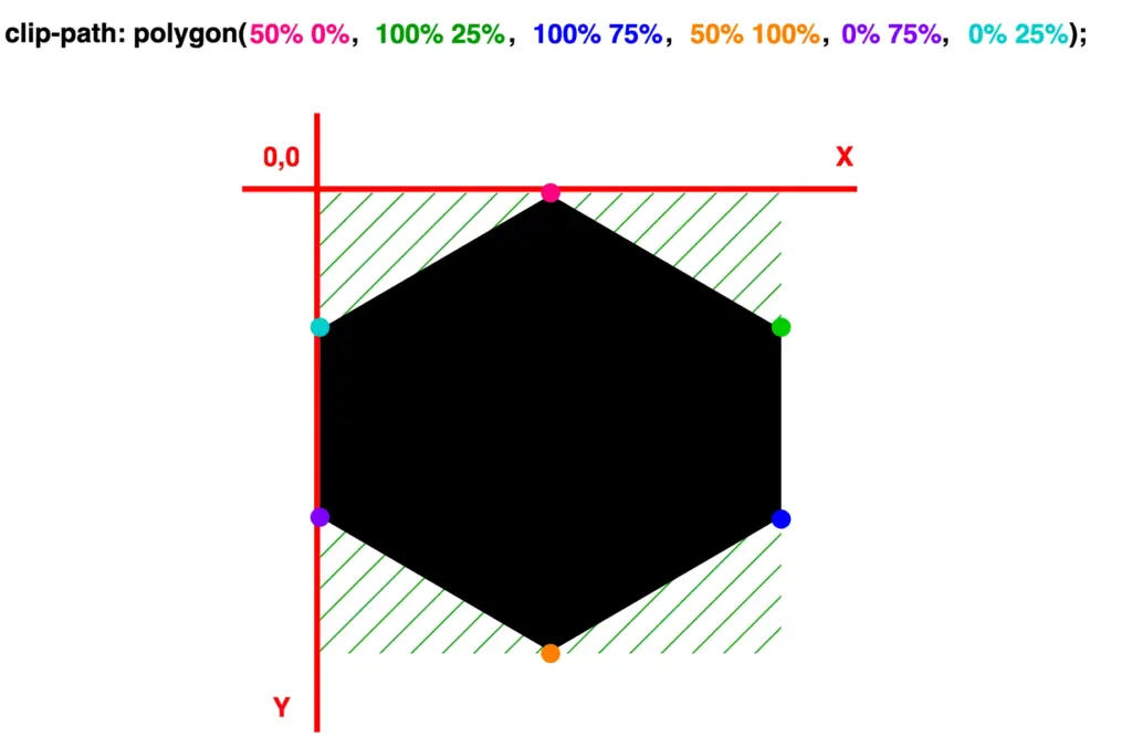
Create heptagon
/* heptagon */
clip-path: polygon(
           50% 0%,
           90% 20%,
           100% 60%,
           75% 100%,
           25% 100%,
           0% 60%,
           10% 20%);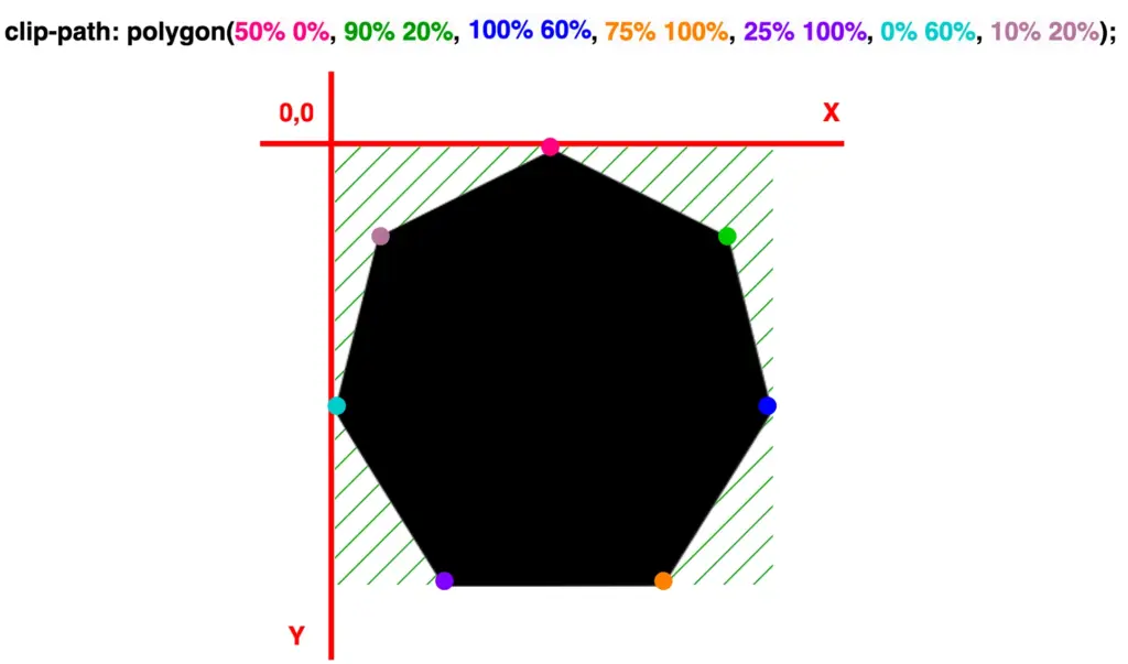
/* heptagon oriented downward */
clip-path: polygon(
           25% 0%,
           75% 0%,
           100% 40%,
           90% 80%,
           50% 100%,
           10% 80%,
           0% 40%);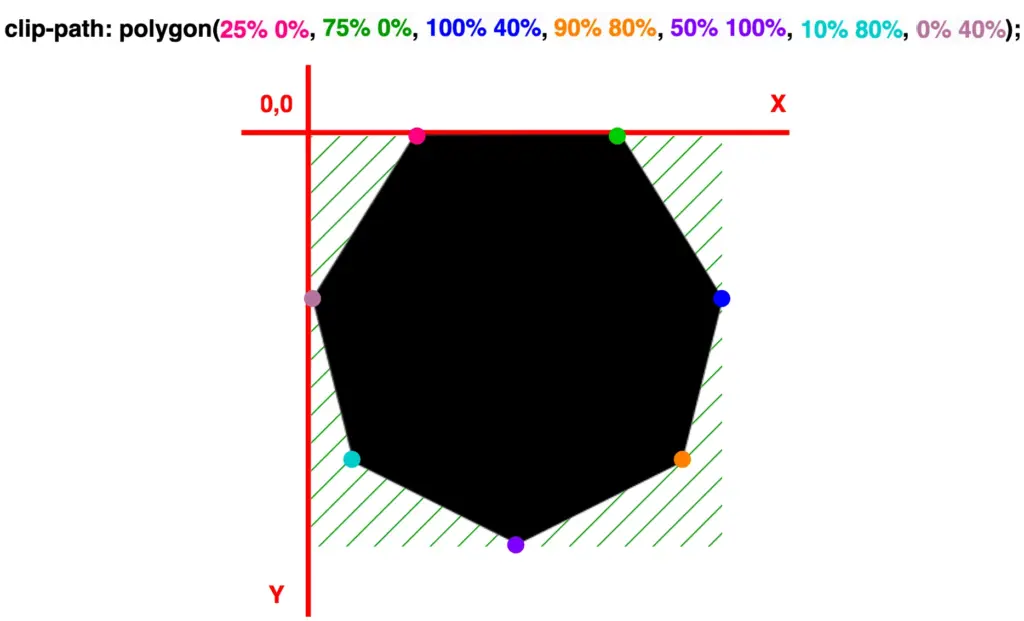
Create octagon
clip-path: polygon(
           30% 0%,
           70% 0%,
           100% 30%,
           100% 70%,
           70% 100%,
           30% 100%,
           0% 70%,
           0% 30%);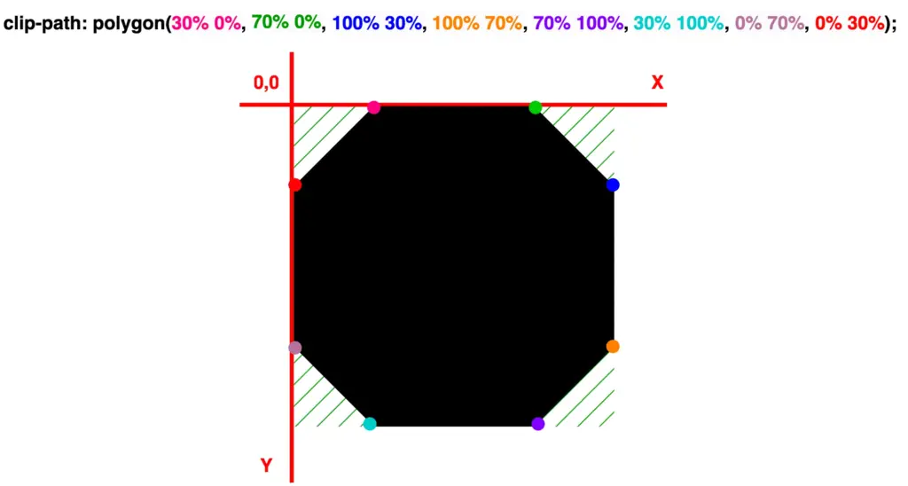
Create nonagon
/* nonagon */
clip-path: polygon(
           50% 0%,
           83% 12%,
           100% 43%,
           94% 78%,
           68% 100%,
           32% 100%,
           6% 78%,
           0% 43%,
           17% 12%);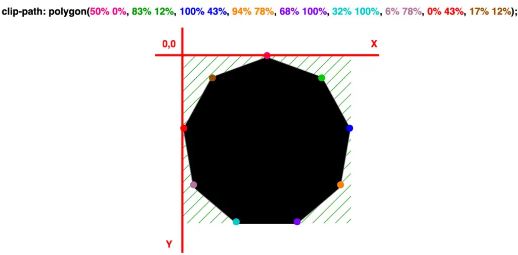
/* nonagon oriented downward */
clip-path: polygon(
           32% 0%,
           68% 0%,
           95% 23%,
           100% 57%,
           85% 87%,
           50% 100%,
           15% 87%,
           0% 57%,
           5% 23%);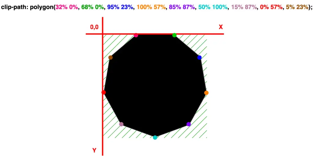
Create decagon
clip-path: polygon(
           50% 0%,
           80% 10%,
           100% 35%,
           100% 65%,
           80% 90%,
           50% 100%,
           20% 90%,
           0% 65%,
           0% 35%,
           20% 10%);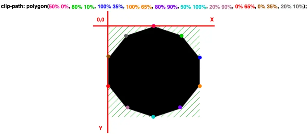
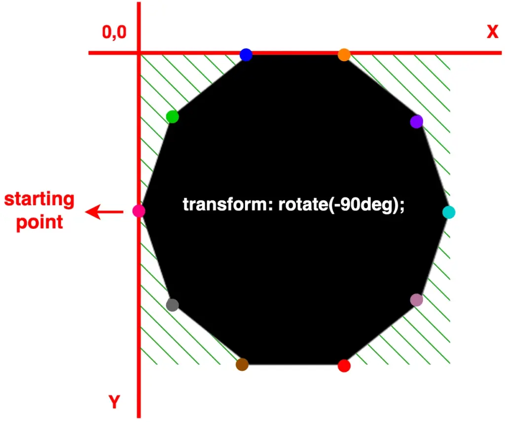
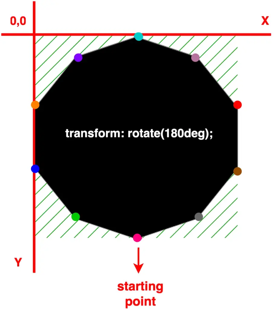
Adjust polygon rotation for simplicity
To make things easier, we are free to create only one type of shape at a time and adjust its direction by customizing its orientation.
For instance, as demonstrated below, we can use a decagon shape, which is the last shape we created above, and modify its degrees through the transform: rotate() CSS property. In that way, we set the orientation according to our preferences.
More specifically:
- In case 1, we notice our decagon rotating 90 degrees to the right
- In case 2, with the use of a negative value, our decagon moves anticlockwise and rotates 90 degrees to the left
- In case 3, it rotates 180 degrees to the right, resembling a downward orientation
🔖 Pay attention to how the colorful dots shift from one place to another, updating their positions each time we change the rotating value. 🥳
/* case 1 */
transform: rotate(90deg);
/* case 2 */
transform: rotate(-90deg);
/* case 3 */
transform: rotate(180deg);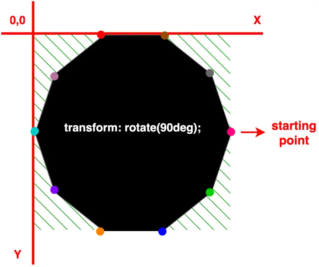
Leave a reply