Easy Made Circles – A Simple Guide to clip-path CSS Property
On this page
The clip-path property in CSS lets you control which part of an element is visible by defining a specific shape, no matter what the element’s shape is. It’s like placing a mask over an element—only the area inside the shape will be shown. Everything outside will be hidden. This provides a clever way to “cut out” parts of an element without needing extra images or complex code.
A great tool for creating unique layouts, applying image effects, and designing custom shapes. CSS supports several shapes for clip-path, including circle(), ellipse(), inset(), and polygon()—each giving you different ways to shape your content and hide any parts you don’t need. 🪄
In today’s post, we’ll focus on the circle() ⚫ function and explore how it works. 🧐
Let’s dive in!
The circle() function
The circle() function is one of the simpler ways to create circles by clipping an element into a rounded shape with a radius of our preference based on the element’s smaller dimension (width or height, selecting the smaller one, ensuring the circle fits within the element).
Traditionally, we can use pixels px and percentages % to define the dimensions and the position of the circle. Otherwise, we can just utilize the handy center keyword, which is responsible for positioning our circle.
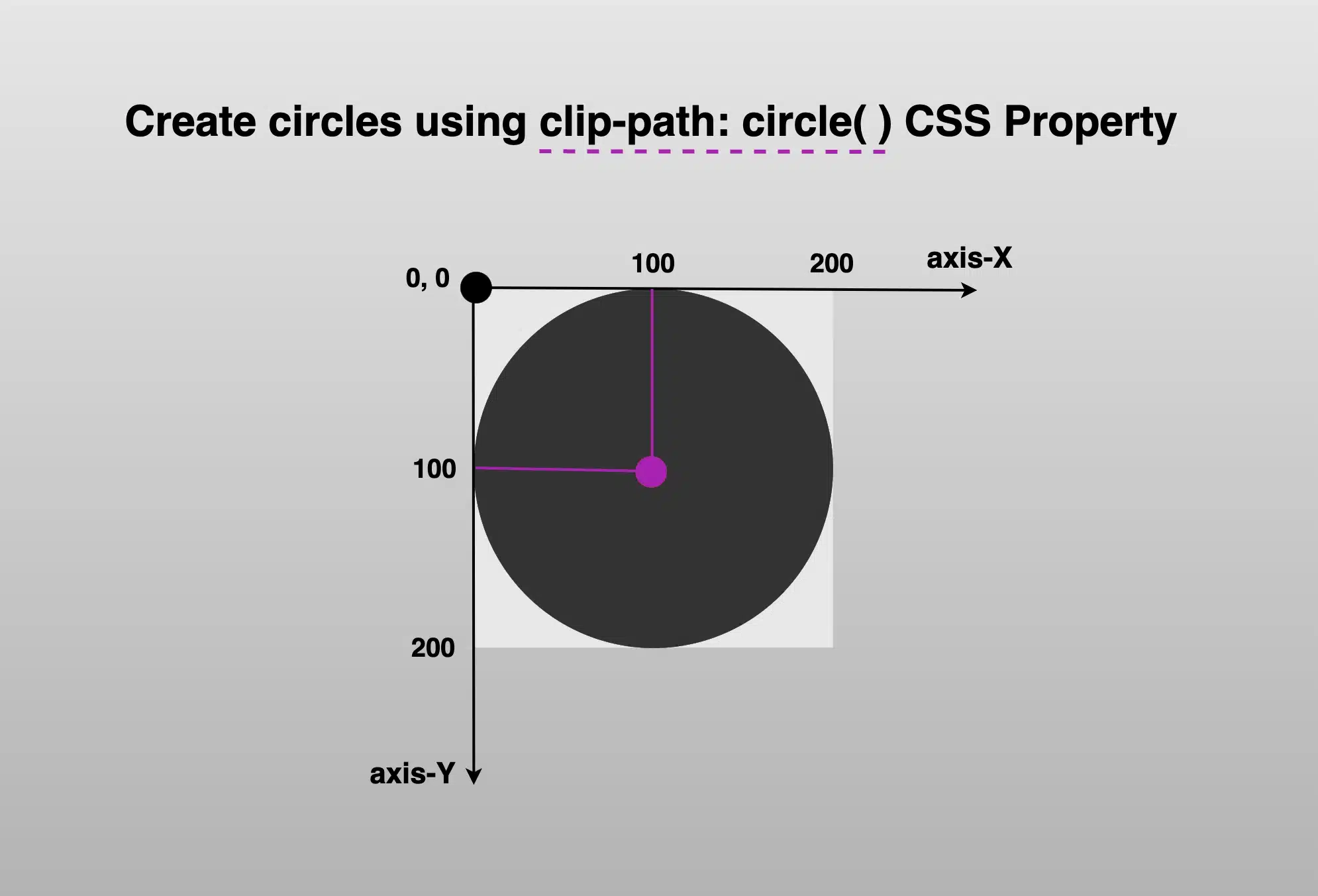
Below, we see the starting setup we’ll use to explore this awesome CSS property. It shows a dark grey square, with a width and height of 200px. Also, a small white dot marks its center. This allows us to visualize exactly how the circle is positioned. The square is placed on an axis to make things even clearer.
This helps explain both positioning and how the circle will be clipped inside it (inside the square element). 📐 😃


The circle(radius at axis-X axis-Y) function using pixels and percentages
It defines a circular clipping area using two values: the radius of the circle and its center point. We set the radius to 100px wide or 50% of the element’s width, and we positioned it 100px from the left and 100px from the top of the element or 50% 50%, which places the circle right in the element’s center. Everything outside the circle will be invisible.
This creates a circle that is perfectly centered within the square.
.circle {
      // circle(radius at axis-X axis-Y) //
clip-path: circle(100px at 100px 100px);
}
              // OR //
.circle {
   // circle(radius at axis-X axis-Y) //
clip-path: circle(50% at 50% 50%);
}
Now, let’s try to cut ✂ a smaller circle. Maybe with a radius of 80px. How would our code and circle look now? Check out the updated code snippet below.
We’re still cutting out a specific shape, a circle, from the element, but this time the circle is smaller (radius of 80px or 40% of the element’s width), though it is centered at the same spot as before (100px from the left and 100px from the top or 50% 50%). That means the circle stays perfectly centered within the square.
.circle {
clip-path: circle(80px at 100px 100px);
}
              // OR //
.circle {
clip-path: circle(40% at 50% 50%);
}
🔖 Bear in mind that we can combine pixels with percentages, too. E.g. clip-path: circle(80px at 50% 50%);
Using % instead of pixels, it makes our shapes responsive and adjusts to the size of our elements each time. In that way, our designs are more flexible and adaptable to different screen sizes.
The circle(radius) function
Another way to create circles using clip-path is the circle(%). It clips the element into a perfect circle with a radius of our preference. Additionally, since you do not specify a position, it centers by default at 50% 50% (50% horizontally and 50% vertically).
Below, we have two examples. The first one has a radius of 50%, while the second has a radius of 40%, allowing for easy comparison with the previous examples.
.circle {
clip-path: circle(50%);
}
      // OR //
.circle {
clip-path: circle(40%);
}The circle(radius at center) function using the ‘center’ keyword
It defines a circular clipping area using the radius and the keyword center. Using this method, we create a circle with a 100px radius perfectly 🎯 centered inside the element. Anything outside that circle will be hidden.
🔖 Note that setting the center it is the same as writing 50% 50%, maintain a cleaner and clearer code. ✨
.circle {
  clip-path: circle(100px at center);
}
            // OR //
.circle {
clip-path: circle(50% at center);
}Likewise, if we create a smaller circle.
.circle {
  clip-path: circle(80px at center);
}
            // OR //
.circle {
clip-path: circle(40% at center);
}clip-path: circle() VS border-radius
Now, let’s see why we are utilizing the clip-path instead of simply relying on the border-radius CSS property. As we mentioned earlier, when setting the clip-path, we deal with two main values: the radius, similar to what border-radius offers, and the positioning, which is particularly important if we want to create a circle that is not 🎯 centered within the element.
Let’s create our circle again, with a radius of 80px or 40% (depending on your preferences – if you use px or %). Next, position it, but not in the center of our element (50% 50%).
🔶 If we want the visible part to be closer to the top side, we keep axis-X at 50%, but we change the axis-Y from 50% to 40%.
🔶 If we want the visible part closer to the right side, we keep the axis-Y at 50%, but we will change the axis-X from 50% to 40%.
.circle {
     // circle(radius at axis-X axis-Y) //
  clip-path: circle(80px at 50% 40%);
}
              // OR //
.circle {
  clip-path: circle(40% at 50% 40%);
}CSS
.circle {
// circle(radius at axis-X axis-Y) //
clip-path: circle(80px at 40% 50%);
}
// OR //
.circle {
clip-path: circle(40% at 40% 50%);
}CSS

Setting clip-path instead of border-radius gives us the privilege to focus on any part of our element we prefer, not just the center. A really useful method, especially when working with images 📸 and you want to keep a part of the image that is not necessarily at the center.
Let’s examine another case. What do you think? Are we able to vanish 🎩🐇 a whole piece of our circle and keep only a small part if needed? Let’s see the following code snippet. We position the center of the circle at zero (0%) on both axis. This means that the center of our circle will be placed at the top-left corner of the initial element, as that’s the point where both axes X and Y begin.
.circle {
clip-path: circle(80px at 0% 0%);
}
              // OR //
.circle {
clip-path: circle(40% at 0% 0%);
}Take a closer look at the image below. Since the circle is positioned at the element’s top-left corner, only the 🕞 quarter of the circle that fits within the element’s bounds will be visible, all the rest, that is extended beyond the element’s boundaries, will not be displayed at all. Cool hug! 😎

Apply clip-path to images
Now it’s the perfect time to analyze how we can utilize clip-path with images. A clever way to control their shape and also ‘cut out’ and leave in view only a specific part of the image.
In the following example, we’re working with an image that contains four avatars, each placed in one of the image’s corners: top-left, top-right, bottom-left, and bottom-right. The image is divided into four equal parts, with one avatar in each. By using the clip-path: circle() function, we can focus on just one avatar at a time.

First, we apply clip-path: circle() to cut out the top-right part of the image, revealing only the avatar placed there. Then, we do the same for the top-left corner to show the avatar in that section. We repeat this process for the bottom-left and bottom-right parts as well, effectively isolating each avatar with a circular crop.
Depending on the visual balance and spacing, you can choose 45% (blue 🔵 border) to match the exact size of the avatar or go with 50% (green 🟢 border) to include a bit of extra white space from the image background for a more relaxed look. 🌈 😎
To target and isolate each avatar at the top of the image:
🔶 For the top-right avatar, we place the circle’s center at 25% 25%. This moves the circle’s center closer to the top-right side of the image.
🔶 For the top-left avatar, we set the position at 75% 25%. This turns the focus to the top-right area of the image.
Adjusting these percentages gives you fine control over what part of the image stays visible, allowing you to highlight exactly what you want.
.circle {
    // circle(radius at axis-X axis-Y) //
clip-path: circle(45% at 25% 25%);
}
              // OR //
.circle {
clip-path: circle(50% at 25% 25%);
}
.circle {
// circle(radius at axis-X axis-Y) //
clip-path: circle(45% at 75% 25%);
}
// OR //
.circle {
clip-path: circle(50% at 75% 25%);
}

Below we can see the final results for the two avatars. The first image displays only the first avatar while the second presents only the second one. All the rest of the avatars will be hidden. Pretty cool, right?


This technique allows us to pinpoint and display specific parts of the image. Then, with the necessary positioning, we put this specific part of the image in our desired place. 😃 ✨
[lct id=”related-posts” postids=”26010,25620,25284,27121″]