Made Easy With Reusable Code – Why Classes Matter

Advertisement
On this page
When building 🏗 websites, it’s common to create reusable code. What about you? Have you ever wanted to style multiple elements consistently without repeating yourself? That’s where CSS classes come in handy! They are flexible, well-structured, and designed to style multiple elements at once, giving them a consistent look. They assist you in reusing styles efficiently and also maintain your code organized and clean. 🧹 🧱
Reusing styles with classes
To highlight the value of reusable code with classes, consider the following simple example.
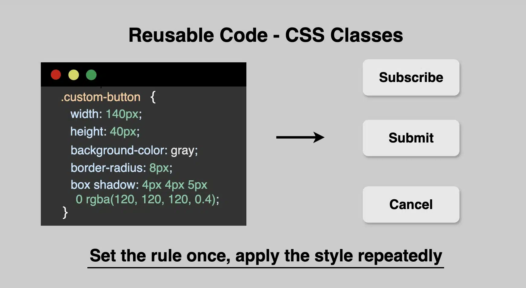
Example
Let’s say we want to create several buttons that all match in style and look uniform across the page.
<button class="custom-button">Subscribe</button>
<button class="custom-button">Submit</button>
<button class="custom-button">Cancel</button>.custom-button {
width: 140px;
height: 40px;
font-size: 20px;
font-weight: normal;
color: black;
background-color: e6e6e6; /* gray */
text-align: center;
border: none;
border-radius: 8px;
padding: 10px 20px;
box-shadow: 4px 4px 10px 0 rgba(120, 120, 120, 0.4); /* semi-transparent gray */
display: inline-block;
cursor: pointer;
}As we can see below, all three buttons share the exact same characteristics by only sharing one class, the .custom-button. Whenever we want to restyle the buttons, we only need to make changes to this class, and the changes will take effect instantly on all buttons.
Incredibly impressive but made easy at the same time! 😎


The importance of keeping names precise and descriptive
When creating class names, try to make them short yet meaningful. Do not use unclear and generic names. A name like .custom-button or .card-header gives a clear idea of what the class is for. Pick names that make sense at a glance. Descriptive names help you and others understand your code later, especially in larger projects.
✔ DO
.profile-card {
  width: 250px;
  height: 250px;
  background-color: grey;
  border-radius: 50%;
}❌ DON’T
.card {
  width: 250px;
  height: 250px;
  background-color: grey;
  border-radius: 50%;
}Add Concise Comments
Last but not least, always accompany classes with comments. Comment with precision. Your comments should clearly explain why you are using a particular approach rather than simply describing what the code does.
Additionally, update comments as your code evolves. Outdated comments can be more harmful and misleading than having no comments at all. 😉
Below, I have included an example.
Remember, the correct way to declare a comment is:/* This is a comment in CSS */.
/* limit width to improve readability on large screens */
.container {
  max-width: 1200px;
}Using reusable classes in CSS saves time and keeps your code well-organized and maintainable. So, next time you catch yourself repeating the same styles again and again, try grouping 🧲 them into a class!